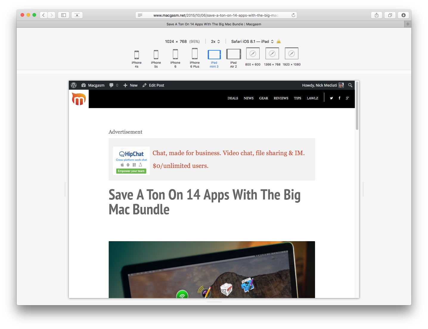
More and more Web designers are building websites to be “responsive”—that is, they’ll adapt to show content in a format that’s most appropriate for whatever device you’re browsing on. For example, if you visit Macgasm on an iPhone, the headline text and images on the homepage will automatically resize to a more mobile-friendly size. If you’re building a website and want to see how it appears on different screen sizes, Safari’s new Responsive Design Mode is for you.
To get to it, you’ll need to be running OS X El Capitan, and you’ll need to turn on Safari’s Develop menu if you haven’t already done so. To do so, hop on over to Safari > Preferences, click Advanced, then check the box labelled “Show Develop menu in menu bar.”

Go to the webpage you’re working on, then go to Develop > Enter Responsive Design Mode. Just like that, you’ll be able to see how your page looks on various iOS devices, as well as on other common screen resolutions. You can resize the viewable area by mousing over the edge of the webpage and dragging left or right. Toggle between the different viewable areas offered, and see how your webpage changes from device to device—you might just find a bug you didn’t notice before.
Once you’re done, Go to Develop > Exit Responsive Design Mode.


