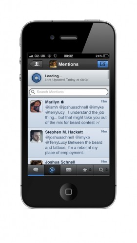
I had been waiting for this Tweetbot for over a year. Seriously. Back on March 12th, 2010, Tapbots posted on their blog that they were working on a new Twitter client — Tweetbot. I’ve been a fan of their previous apps, so my expectations were set pretty high.
Twitter apps are by far my favourite kind of iOS app, and I try pretty much any new – well designed – client that’s released. So, imagine my excitement when I saw my timeline explode with news of Tweetbot’s release on April 13th. To the App Store I ran, purchasing immediately. I then lost hours of my life.
My Twitter app is easily the most used on my iPhone, and I have very specific features I require — I assume most users are like this. Tweetbot delivers all of these features for me. Nothing is missing. Tapbot appears to have created a Twitter client to the quality that we have come to expect from them. Obviously not everyone will be happy as there will always be ‘X feature’ that doesn’t work as they expect. But this lends itself to the idea I set out—we all have our own specific preferences.
What’s Macgasmic?
Tweetbot is polished to perfection. It’s the work of a master-craftsmen. The end result of this app has been laboured over extensively — in the hope to get things just right.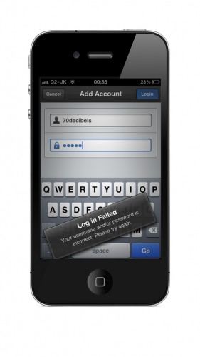
Tapbots clearly decided to go an interesting and painstaking route with this application. It has been said that every pixel is custom built; they started from scratch. A great example of this is what they have done with ‘alert boxes.’ They have a fresh and attractive custom design with a cool animation to boot. You can see this if you reject leaving the app to look at an external link or if you enter an incorrect password on the account screen—the alert tumbles away before returning you to your previous screen. Beautiful.
There has been a lot of talk surrounding Tweetbot over the past couple of weeks. It has been an app that has heralded much discussion. Some love it and some feel that it is still lacking. I understand the views that have been put forward stating that the app has not brought anything new. However, I don’t see this as a negative as some others have.
I look at this from a positive angle. As I mentioned earlier, Tweetbot has all of the features I require. I can’t think of any feature that I miss from Twitter For iPhone. But what Tweetbot does is makes things beautiful. Twitter For iPhone is a well designed app, but not to the level that the guys at Tapbots have managed. I’m aware that this is obviously a matter of personal taste, but I’m rather a fan of the industrial look and color-scheme they have created.
Another addition I’m extremely pleased with is the sound effects. When using Tweetbot, you’ll find varying sound effects for when new tweets are loaded or sent, when replies are received or when you retweet. These noises make me a Twitter power user. I’m very active when I use Twitter—I frequently retweet, reply and send tweets of my own and having audio cues to tell me when these actions are completed is fantastic. No longer do I need to wait for anything visual or see if something has been posted. Additionally, any visual alerts – when a Tweet is posted for example – are not intrusive at all. I actually find them to be rather beautiful. For example, instead of a large dialog box in the middle of the screen, you’re met with an attractive blue bar that slides down from the top of your timeline, then disappears.
What’s Not?
Ah.. Well this is the tricky part. There is nothing in this app that annoys me. Nothing. Some of the things people have complained about – lag when account switching, lack of landscape mode, difficulty to find some settings – do not bother me at all. I appreciate that people have decided to stick with their current clients due to things that irk them. I’m just having trouble finding anything. I’m also not refuting that these issues exist. They’re just not things that trouble me, so I find it hard to criticise over them.
I seem to only have positive things to say. Like the fact that Instagram images load inside the app like a Twitpic image – you don’t have to go out to the webpage – or how much I love the ‘blue circle’ animation to indicate Pull To Refresh. See, even when I’m meant to find bad points, I resort to more things I love.
Whenever I review an app I try to find some negatives. I try to find points about it that make it less than perfect. However, I have yet to find any fault with Tweetbot. I have no personal issues with it. You can see that I’m trying to stress that this is just my opinion as I know some will disagree. But this is how I see it.
Conclusion
Tweetbot has been a polarising app. Some people love what it does and others are not so keen. However, I cannot polarise myself. This may be due to the fact that I’ve waited so long to see this app. But I had built such high expectations for it, I’m surprised they have been met.
I love the UI design. It’s incredible. I find every button, alert box, window, timeline — and of course the icon — simply stunning. It went straight to my homescreen and has remained there ever since. I have deleted all other Twitter clients from my iPhone, which is something I have not done before.
If you haven’t bought Tweetbot then go out and do it. Make up your own opinion of the app, but I have a feeling you’ll enjoy it. Maybe not as much as me, but I don’t know of anybody that does.


