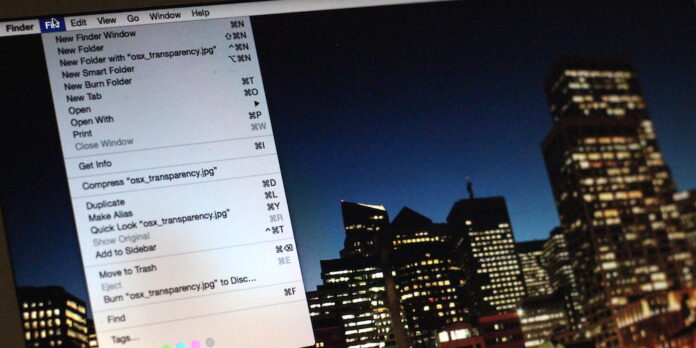
Back in 2007, Apple released Mac OS X Leopard, and with it, introduced a new, transparent look to the menubar. It looked great in demos, but in some circumstances, it rendered the menubar text hard to read. Shortly after, Apple added a checkbox in Desktop and Screen Saver preferences that let you turn off the transparent menubar if you didn’t like it.
In Yosemite, the checkbox is gone, and the new “frosted glass” look to transparent interface elements greatly improves readability compared to the old-style transparency, but you can still tone down the see-through elements if you want.
Open System Preferences and go to Accessibility. Next, select Display from the source list along the left, then check the box labelled “Reduce transparency.” Checking this box will eliminate gratuitous transparency from the menubar and menus, the Dock, and application windows. It’s not as pretty, but it can improve readability and cut down on distractions.
Here’s what Yosemite looks like with transparency effects turned on:
…And off:
Unfortunately, you can’t turn off transparency for just one on-screen element using this setting—it’s an all-or-nothing deal in Yosemite. But the options there if you want it.


