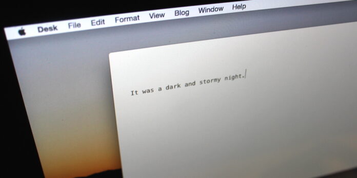
I don’t spend a whole lot of time thinking about which app I use to write with. If it accepts text input and stays out of my way, I’ll use it. I’ve written articles, blog posts, and an as-yet unfinished short story (I’ll finish it someday) in Pages, TextEdit, Microsoft Word, SubEthaEdit, Stickies,…even in Apple’s Notes app. I’m not too picky. But when I saw John Saddington’s $30 writing app Desk, I was intrigued, and decided to buy it from the App Store and give it a go. I found Desk to be a beautiful, enjoyable app, but it has a few quirks that may hinder you at times.
Table of Contents
Your Words Take Center Stage
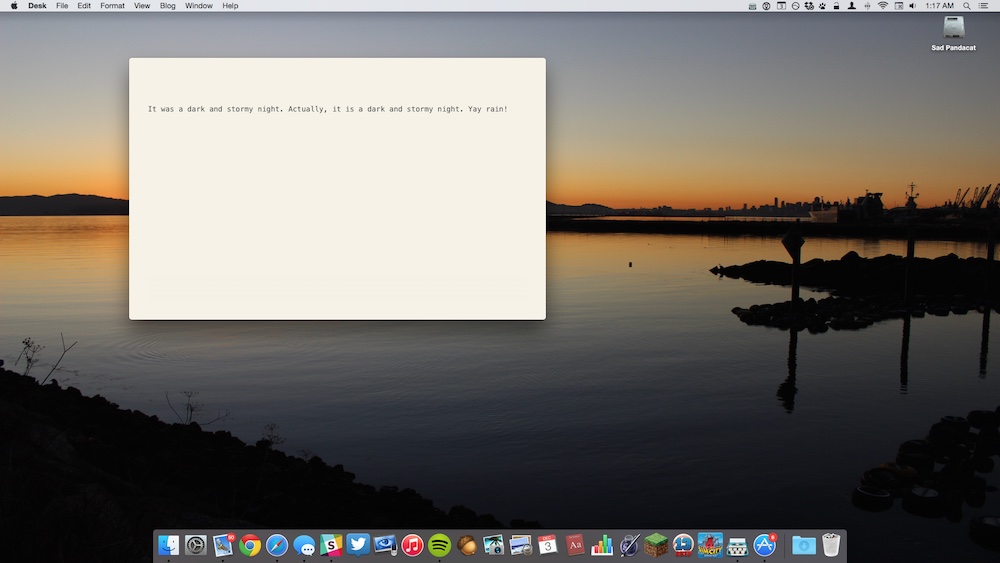
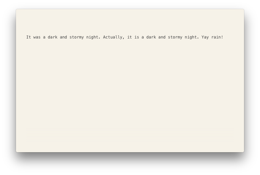
Desk’s website touts the app’s “true distraction-free interface,” and it lives up to its billing. Open a new document, and you get a blank window with a title bar. Start typing, and the title bar disappears. In fact, as you type, there’s nothing to get between you and your words—no toolbars, no prompts, no scrollbars. It’s just you and your text.
Open Desk in a new Space via Mission Control and disable notifications, and you’ll get teleported to an earlier, typewritten age. All that’s missing is the “ding” sound when you hit the end of a line.

Desk 1.0
$30 US; desk.pm
What’s good: Beautifully designed. Lets you focus on your writing.
What sucks: Editing interface has some quirks.
Buy it? Desk is a good choice if you’re looking for an enjoyable writing experience, but it still has plenty of room to grow. Wait until version 1.1.
Mouse over the window, and you’ll get some additional details about your document: a character count, a word count, and a meter that shows approximately how long it would take to read your post (useful if you want to make sure your “short” blog post is, you know, actually short).
A narrow sidebar along the right-hand side lets you view your drafts, publish your literary creation, and open a preview of the finished product. The preview feature is a little rudimentary in that it won’t show you exactly how your post will look on your blog, but it will give you a feel for your post’s formatting and layout.
An optional Night Mode switches the display to show white text on a dark background so you don’t get blinded when inspiration strikes late at night. It’d be great if you could choose to have Night Mode automatically kick in at sunset—just as an extra nicety.
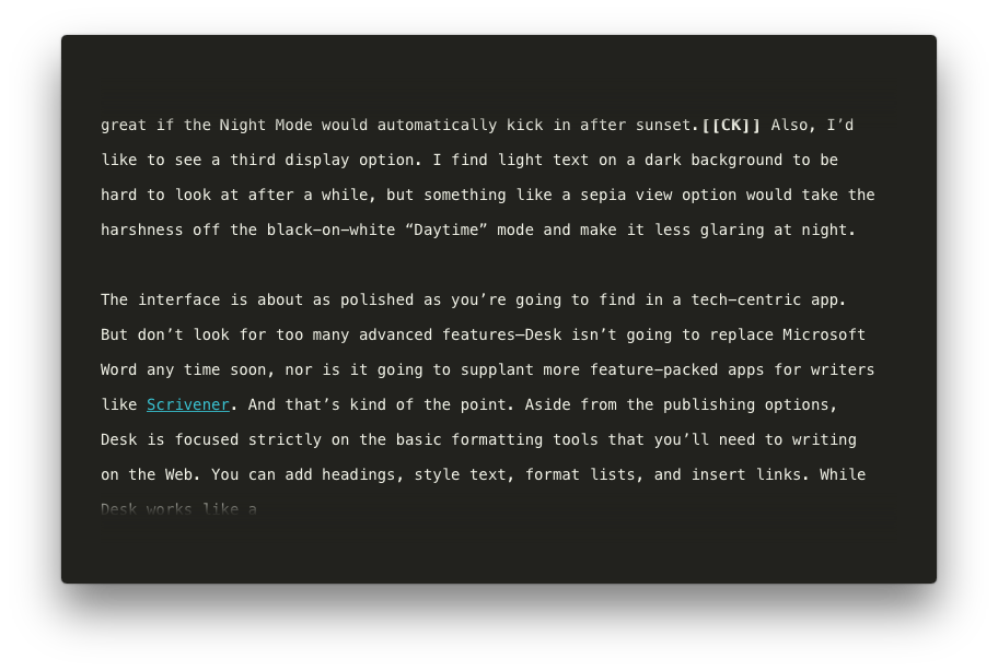
But don’t look for too many advanced features—Desk isn’t going to replace Microsoft Word any time soon, nor is it going to supplant more feature-packed apps for writers like Scrivener.
And that’s kind of the point. Desk does only a few things, and for the most part, it does them well. Aside from the publishing options, Desk is focused strictly on the basic formatting tools that you’ll need for writing on the Web: You can add headings, style text, format lists, and insert links. Prefer Markdown to rich-text formatting? Desk covers that too.
In addition, Desk lets you add photos to go with your words by dragging and dropping images directly into your document. Click on an image, and Desk will display drag thumbs for resizing the image, as well as alignment tools so you can position it just how you want in your text.
The image tools are basic, but they do what they’re supposed to do. A quick tip: When you resize an image, you may end up distorting it, making it appear stretched or squished. To avoid this, use the drag thumbs on the corners of the image to scale it without causing distortion.
Publishing From Desk
If your blog uses one of a number of popular platforms, you can publish directly from Desk itself—no copying and pasting necessary. Click the Share button in the sidebar that appears along the right edge, press the “+” button, enter any information requested of you, then press the Connect button. At this point, you may be presented with a webpage that asks for your login information for your blog. Enter it, log in, approve Desk with your blogging service, and you should be set.
I had some trouble connecting the app to my Tumblr blog—I had to try linking it to Desk several times before it would work—but I suspect this was a product of my slow-ish home DSL connection. If you encounter this problem, wait until the spinning loading indicator disappears before you enter your login information, and it should work. A better loading indicator—perhaps one that blurred out the login page until it was ready—may prevent this annoyance.
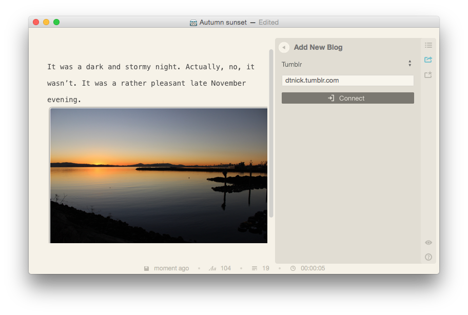
Once you have everything set up, though, the Share feature is painless to use–click the Share button, select the blog you want to publish to from the list, apply any tags or metadata to your post if applicable, then click the Publish button. Desk takes it from there. You can also set any of your blogs for use with the Quick Publish feature, which lets you publish a post to your blog with only a couple clicks.
Desk can publish directly to WordPress, Tumblr, Blogger, Typepad, Moveable Type, and Squarespace sites; it also supports posting to Facebook. Unfortunately, I didn’t have a chance to try all of the publishing options, so I can’t say how well it works for all the supported platforms.
Not Without Annoyances
Desk is well designed and easy to use, but it does have a few quirks. The editor window doesn’t render any white space between paragraphs, so paragraphs appear to run into each other. When you look at your text in the Preview screen, however, the paragraph breaks appear as you would expect. To get around this, you can press the Return key a second time between paragraphs, but that inserts an extra paragraph break. A little white space between paragraphs in the editor window would greatly aid in readability and eliminate the need to tap the Return key twice to have a easy-to-parse draft.
(Speaking of which, Desk added an extra paragraph break between paragraphs when I cut and pasted large blocks of text. This is, presumably, a bug. It’s not a big deal, but it does mean that you’ll have to do a little cleanup to your text afterward.)
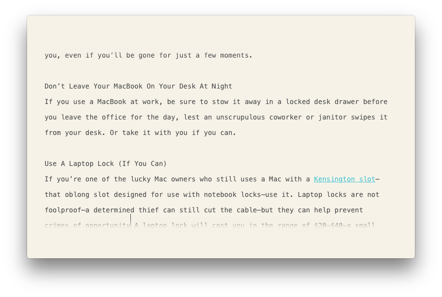
Text at the very top and bottom of the window fades to white, which makes for a pleasing visual effect, but it also means that the line of text you’re typing can become obscured by the fade effect. This is a minor issue, however.
Also, the text selection functionality doesn’t quite adhere to OS X conventions. Normally, shift-clicking text in a field will select the text between the insertion point’s original location and where you clicked—a handy shortcut I use all the time to select blocks of text. This shortcut doesn’t work in Desk 1.0, unfortunately.
None of these annoyances are deal-breakers, but if certain text-editing conventions are deeply ingrained into your muscle memory, you might find yourself frustrated at times.
The Writing App For You?
Desk makes for a very pleasant writing experience by and large, but it needs just a bit more tweaking and cleanup before it becomes my main writing app. Still, I like Desk, and I look forward to seeing how Saddington builds upon it. Some issues are to be expected—it’s a 1.0 app, after all—but it’s a solid start for an app that should evolve into an excellent tool for writers.


