So we’re still talking about the weather in North America, mostly because it refuses to stop trying to kill us. We’ve got an iconic iOS weather app that got a hearty feature update. After that we have news summary app that joins the fray, this one with customization features. A classic documentarian has an App for iPad that culls his classic material. Then we have an app from the world’s most famous Art rock band. Finally, we have the latest darling in the iPhone RSS race.
Table of Contents
Dark Sky – iOS(Universal)
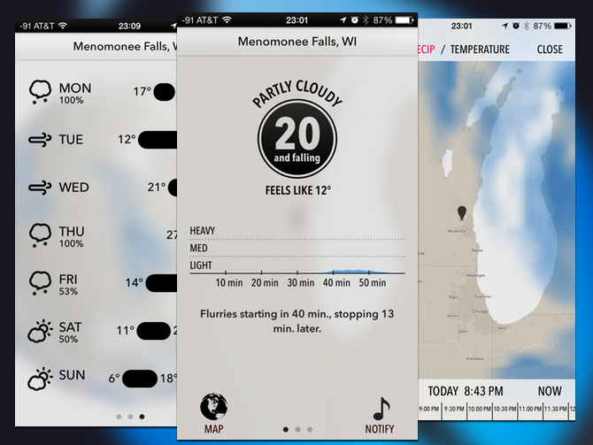
Dark Sky was once known as the app that simply told you the temperature and how soon you could expect rain. After a recent update, the app has become far more full featured. That hasn’t thrilled everyone, but the app does still have a unique style. It’s also still fairly simple, using iOS 7’s layering to create a complex interface without being cluttered. When you tap Map at the bottom of the screen the main interface slides away and you get the map with a time lapse of radar or temperature. If you tap the temperature, you get more detailed stats like wind speed and humidity. One pane to the right is the forecast for the next day, and slide one pane further to the right for the week’s forecast.
Taking an app from minimalist darling to a pure utility isn’t easy, but it isn’t out of the question. Dark Sky succeeds because it retains a good design sense, and keeps the controls minimal. It is still going to be a steep hill to get people to buy a weather app for four bucks. Like a lot of the design forward iOS app, you’re paying for that design. However, Dark Sky does back up that design with solid functionality.
What’s Good: Plenty of data, nice design.
What Sucks: Expensive for a weather app.
Buy it?: If you like well designed apps, and don’t mind paying for them; grab Dark Sky on the App Store for $3.99.
Inside – iPhone
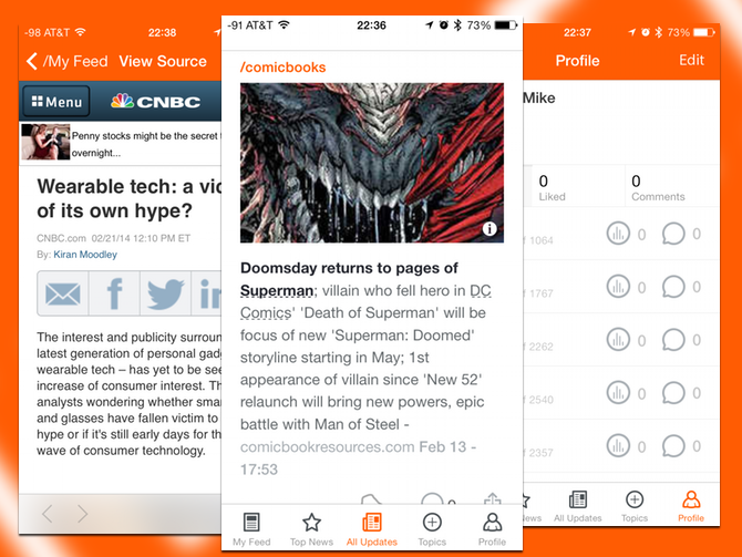
Making it easier to keep up on the news seems to be a new app niche with a lot of players. Inside differs from Circa or Yahoo Digest, going for breadth with filters. Instead of using editors, Inside let’s you customize the news you want to see, creating a custom feed for you. You can still get the big headlines, or even all the news. Stories all have a category, if you swipe to the left you can get additional stories in that category. The app offers a lot of customization, giving you a lot more possibilities than most of the summary apps.
That personalization comes at some cost. There’s a lot of news, but it isn’t easy to get more than a single story on a topic. You don’t have much control over the source of the news either, it would be nice to see a clearer picture of how you’re getting articles. However, if you don’t like the brevity of other news apps, Inside might be exciting.
What’s Good: Lots of customization options, cool interface.
What Sucks: Opaque content sources.
Buy it?: If you’re looking for a news app that gives you a bit more control, but aren’t picky about sources, grab Inside on the App Store for free.
Ken Burns – iPad
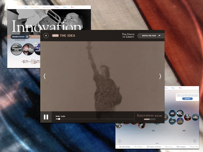
After dominating PBS pledge drives for the better part of two decades, Ken Burns has set his sights on the App Store. The aptly named Ken Burns app synthesizes Ken Burns’ documentaries into a single timeline. Of course the free app doesn’t give you a huge array of videos, instead it’s limited to the Innovation playlist. This is still drawn from an array of sources, but is limited to a half hour of videos. The app also features new material in the form of interviews with Burns that introduces clips, and relates them to the topics. You can get links to watch the entire films the videos are drawn from on either iTunes, the PBS website, or the Netflix App.
If you’re a fan of Ken Burms, this app is a no brainer. The better question is how this app appeals to people who aren’t fans. The large amount of material will give you a good feel for his various films, without having to invest six hours. The design speaks to why Ken Burns has an effect named after him. The timeline is a great interactive tool, and the playlist breaks it up into thematic chunks that are more digestible. Burns tries to make American history into something personal and knowable, and this app shows off how much he believes in that idea. His fixation on American exceptionalism may not sit well with those outside of the US, but that is his authentic voice.
What’s Good: Excellent curation of a huge body of work, great use of links out to whole films.
What Sucks: US-centric view of history may not sit well with non-US audiences.
Buy it?: If you’re a US history buff or a Ken Burns fan, grab Ken Burns on the App Store for free.
PolyFauna – iOS(Universal)
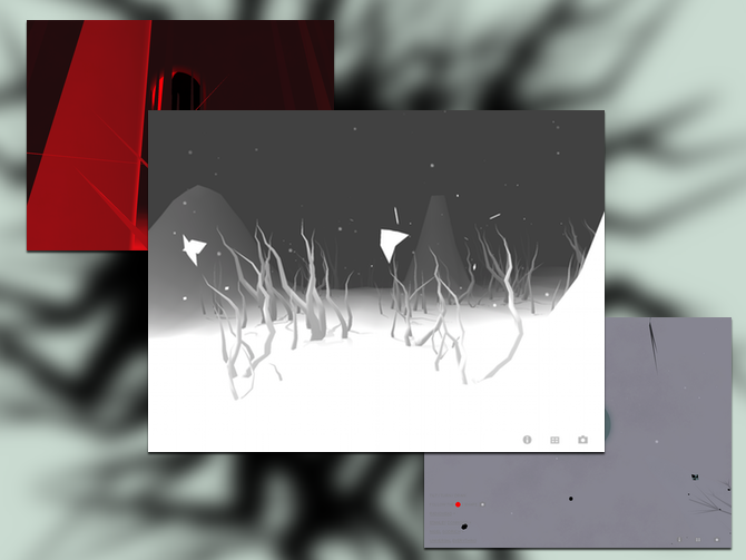
One could easily argue that Radiohead’s new app belongs in the game column, but this is far more a piece of interactive art than it is a game. You do have the goal of finding a red dot that transitions you between scenes. But you also draw to create elements on the screen, and there’s generative music. According to Radiohead’s website the app is meant to evoke experiments in early life, which all the swirling material does evoke the cellular stages of Spore. The graphics are late 80’s, early 90’s computer animation, giving the app a unique look.
This is an interesting little anomaly, more of a curiosity than either a useful app or a game. Fans of the band will certainly be please. Unlike Bjork’s album within an app, this doesn’t really have a new music form the band. The generative music is excerpted from a track on their last album. You can share pictures of what you discover in the app, so I suppose you can say it’s trying to spark conversations. Like all art, what you’re going to get out of this is subjective.
What’s Good: Unique design, interesting experience.
What Sucks: Not much new from the band.
Buy it?: Fans of Radiohead and retro computer animation can check out PolyFuana on the App Store for Free.
Unread – iPhone
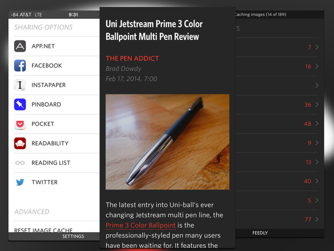
The end of Google Reader has really shaken up the RSS reader market on iOS. Unread is yet another contender looking to capture RSS geeks. Unread seems to have made a rather large splash, but it does deserve the attention. The design is great, as is the interface. You get a simple black, red, and white layout, the background and text reversed between black and white depending on the night or day theme. The interface is based on swiping to pull up contextual menus, like sharing or marking a feed read. The app has a huge array of sharing options, and a built in web browser.
The app may have some great design, but it’s not without its faults. You can’t seem to navigate from item to item from within the articles themselves, instead you have to navigate back to the article list. All of the sharing works well, but the Pinboard option doesn’t let you add tags to your bookmark. It’s also missing Evernote export. That’s a pretty short list of complaints in a field of apps that often a matter of weighing compramises. Unread has a pretty short list of compromises, it supports Feedly, Feedbin, and Feedwranlger. So if you’re hosting your own Fever instance or signed up with another RSS service, you’re out of luck. Also how many apps come with a Philosophy section in the settings.
What’s Good: Great looking app, swipe interface is intuitive.
What Sucks: Some sharing issues, should be able to swipe article to article not having to drop back to the feed.
Buy it?: If you’re not satisfied with the new Reeder, and are still looking for an iPhone RSS reader grab Unread on the App Store for $4.99


