The iPad and the iPhone got all of the love during this morning’s Stevenote to open WWDC. But, later on in the day, while everyone was drooling over the iPhone 4, the marketing and internet browser teams of Apple had other plans in mind.
Safari 5 is making its way around the internet as a much welcomed update to the Apple cross-platform browser.
One of the most anticipated inclusions in Safari 5 is that of Extensions (can I get an amen?!)–this just may make me ditch Chrome and Firefox…we’ll see. Extensions will allow developers to use HTML5, CSS and JavaScript to extend the overall browsing experience.
Along with Extensions, the Safari Reader is now available. The Safari Reader allows one-click access to view articles on the web in a single, clutter-free page (that’s Apple Marketing “speak”). Here’s what Safari Reader actually looks like below—while in the new Safari, I browsed over to Huffington Post and was reading a few articles. Note in the screen shot below, within the URL bar is the word “Reader”.

When you click on the word “Reader”, another page pops up showing just the article text.

Clutter-free, yes. Useful, we’ll see as I use the feature more in the coming days…
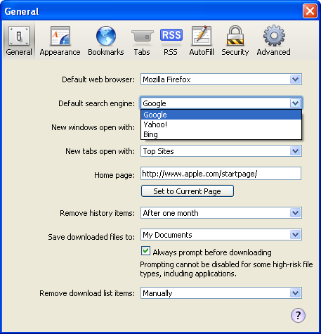
Similar to what was announced with the iPhone 4 this morning, Apple is also showing love to Microsoft by including Bing in the standard list of internet search options (alongside Google and Yahoo). However, Google still remains the default.

Now with all these new enhancements, the big question on all of our minds should be that of speed—how fast is the thing? Because Chrome is smoking fast. Well, apparently, Apple has been focusing on the Chrome market—they’ve been doing benchmarks and boast that Safari 5 runs JavaScript some 3% faster than the latest 5.0 version of Chrome and twice as fast as Firefox 3.6. No one cares about Internet Explorer (sorry !!!).
While working diligently at my day job I’m forced to use a Windows machine (pray for me, people…). That being said, I downloaded Safari 5 for Windows and am now putting it through its paces. I’ll update this post later with my opinions on the Mac version.
What the Windows version does have going in its favor is a more Windows native look—the title bar, border and toolbars have a much more symmetric look to them with other Windows applications.

The font rendering is also done more cleanly on the PC now that Windows Standard fonts are used.
 Over all, it’s a decent update. The browsing experience is pretty fast and I haven’t had any problems going to a variety of sites that I frequent. Now let’s hope that developers jump on this bandwagon and starting coding some killer extensions for the browser.


