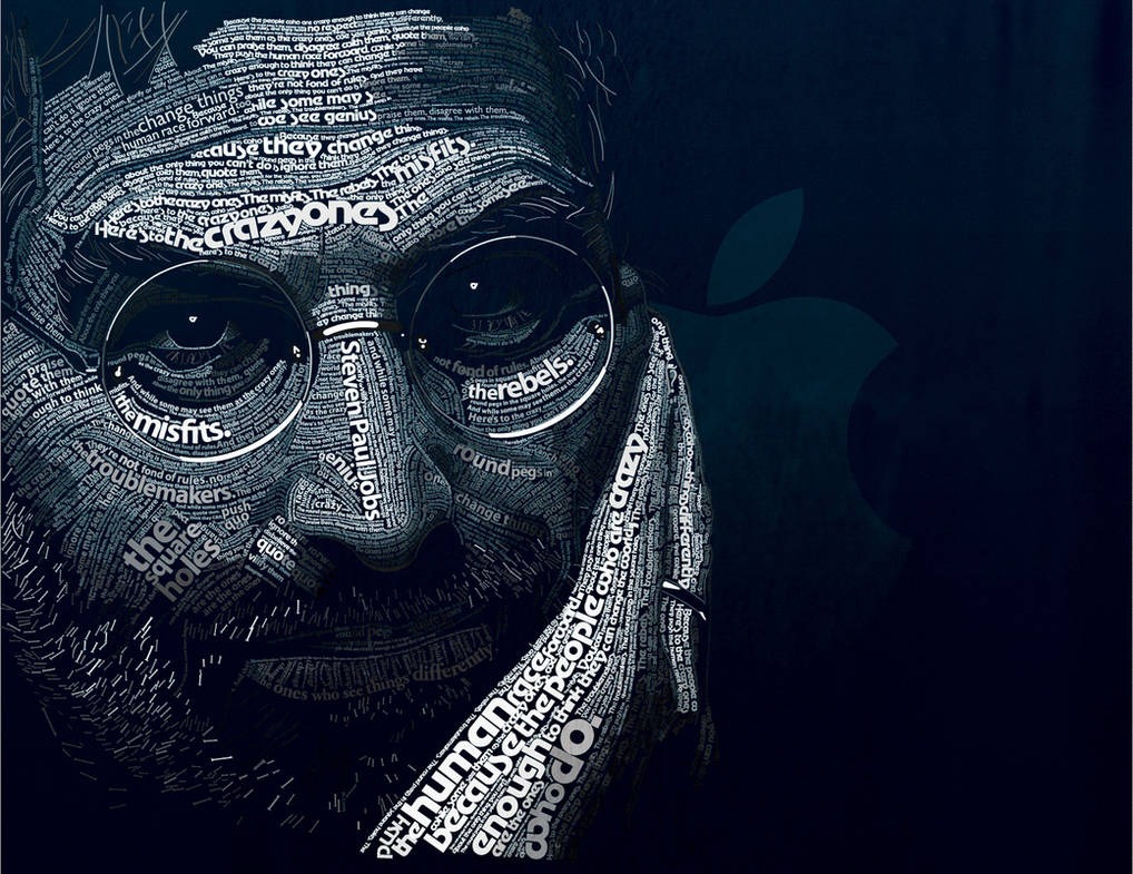
This is just incredible. Dylan Roscover has created this Steve Jobs portrait based on the “Here’s to the crazy ones” ad campaign from Apple in the 90s. Made up in its entirety from only those fonts present in Apple branding and products. You definitely have to click through and check out the attention to detail on it in full size.
In Dylan’s portrait of Steve Jobs, the fonts used have their own story in Apple’s history.
- Motter Tektura: This font looks modern but was used by Apple in its early days in the 70s and 80s.
- Apple Garamond: A classic-looking font that Apple used when Steve Jobs came back to the company in 1997. It’s stylish but not too fancy.
- Myriad: A simple and clean font. Apple started using it in the early 2000s. It’s easy to read and looks modern.
- Univers: This is another simple font without extra details. It’s uncomplicated and clear, just like a lot of Apple’s designs.
- Gill Sans: This one is also neat and easy to read. It fits Apple’s style of making things that are simple and user-friendly.
- Volkswagen AG Rounded: Not really an Apple font, but it’s included in lots of ads for a unique touch. It looks friendly and approachable.
Each font, from Motter Tektura to Volkswagen AG Rounded, reflects a part of Apple’s story and Steve Jobs’ influence. It’s a simple yet powerful reminder of his growing legacy.
All props for the image go to Dylan Roscover


