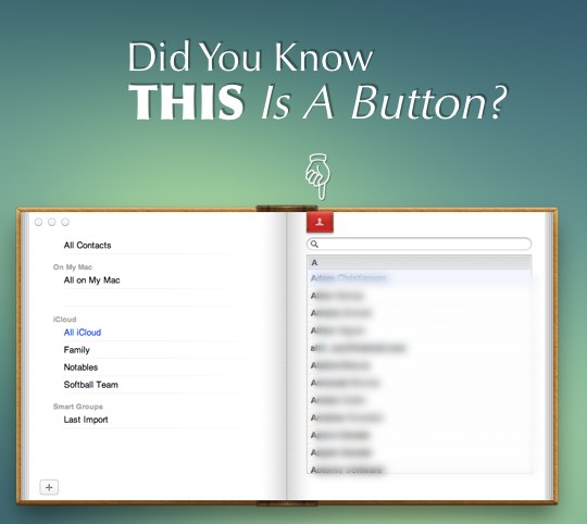
 I’ve spent my fair share of time railing on Lion these last couple of months. Heck, it even sparked someone to call me part of a “corrupt Apple press.” But here’s the thing: no matter how much time passes, and how many times I find something neat in Lion, I still grumble when I realize just how many bugs and design problems remain in it currently.
I’m not a graphic designer by any stretch of the imagination, but I know what I like. What I don’t like is OS X apps that look and feel like they don’t belong on my desktop, but I live with it. I’ve never once pointed out, in public at least, that the new Address Book is ungodly ugly in my eyes. Why? Well, because that’s my opinion, and you’re entitled to think whatever you want about it. People either love or hate the new iPadification of some applications, and I’m fine with that. But what I’m not fine with is applications that suddenly seem to lose functionality, but in reality, they do not.
Doesn’t seem to make sense, right? Take a look at our header again. Did you know that the ribbon was a button? You can click on it, and it adds some functionality back to the Address Book that I’ve long assumed was missing in Lion.
That’s a problem.
I didn’t know it was a button. I found out that it was a button by stumbling on a Reddit post asking people if they knew the ribbon was a button. Opinions are split on Reddit between the people who realized and the people who didn’t realize, but more than not, it seems like those who know just happened to stumble across the button by randomly clicking on the ribbon. There are no visual indicators that reveal that you can click that ribbon and something will happen. I’m not alone here either.
Cmatute on Reddit:
Hey, everyone’s bickering OP for not knowing this was a button, but his point still stands. That thing doesn’t even have a rollover animation, NOTHING to informs us that is a clickable object. I’ve had Lion since it came out, and this is the way I find out there is more to the Address Book application. Not intuitive at all. An example of a good implementation: Flipboard has this same bookmark object, but it has this animation to let you know you can interact with it.
This is a problem.
The problem extends far beyond Lion. The recent release of Yellow Submarine on the iBookstore has had its fair share of posts pointing out just how amazing the book is, but not too many pointed out that you had to stumble your way into finding hidden features, audio tracks and other touch-based perks that are available in the book. Once you find them the book is even more amazing. Yet how many people will actually read through the book but never find all of the hidden Easter eggs? That’s what this kind of feels like, a giant Easter egg hunt. If you find the Easter eggs, good for you. If you don’t, no perks for you. Call me an Apple-nazi all you want, but if I can’t find this stuff, do you think the majority of people can? How about the people who have a hard enough time not adding a bajillion toolbars to their favorite browser?
This makes no sense to me. Does it make sense to you? Did you know that ribbon was a button? If it is, it sure doesn’t look or act like one.
[polldaddy poll=5761028]


