Just like I stated in my Word for Mac 2011 review, I don’t use Office for Mac that much, and I don’t like using it at work either. I prefer text-only programs. Despite this, doing spreadsheets via text does not work all that well, so I do have to use Excel for some things at work.
Excel is one of those applications that is very uniquely positioned. Of course, there a slew of text editors and a few presentations suites, and email clients are a dime a dozen, but spreadsheet programs are much rarer.
Excel for Mac 2011 has undergone a toolbar transition. As with Word 2011, the text underneath the icons has disappeared. Also just like Word, Excel for Mac 2011 allows you to hover over the icon to see what the icon represents.
Excel 2011 sees the return of the ribbon across the entire width of the window. As you stretch the window out, you will notice that the ‘Format’ section of the Home Tab expands to reveal additional formats. This is done so as to not leave extra white space within the ribbon.
Excel for Mac 2011 loses the early OS X feel and transitions to the iTunes-like interface, with smaller fontsand sharper corners. This updated look creates a more professional look and feel to the application and moves it away from the ‘toy’ interface that older applications tended to create.
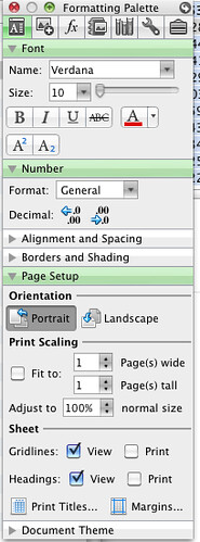
The new ribbon also eliminates the floating toolbox. The toolbox could easily get lost, at least for me. I did not even really notice it was anywhere nearby until I really sought it out. The more integrated interface will make it easier for those who need to go from Windows at the office to Mac at home to be able to find items more quickly.
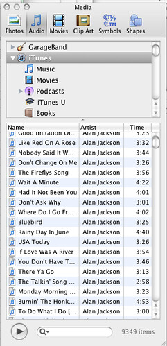
As with Word, Excel also integrates media into the experience. This allows you to include a broader range of media items (e.g., photos, audio, symbols, etc.) without having to know their exact location by using APIs provided by Apple to create a more seamless experience.
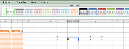
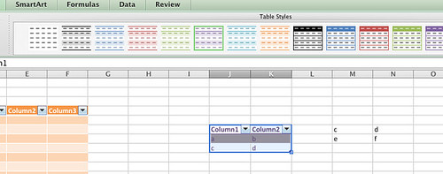
One of the new features for Excel for Mac 2011 is the ability to quickly format a table. This is done simply by clicking on the ‘Table’ tab, highlighting the area you want to be the table, and then clicking which format you would like to have your table display.
Excel for Mac 2011 is also smart enough to automatically decide where a table is. For instance, if you have two sets of data separated by an empty column, and you select a cell in one table and select a table style, Excel will determine where the table ends and only format the highlighted table and leave the other table alone.
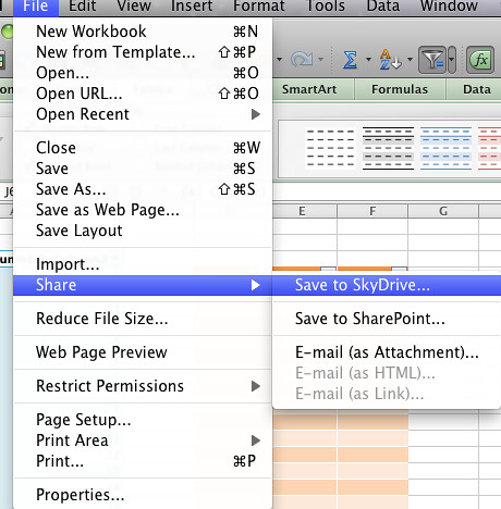
Another new feature that Excel for Mac 2011 incorporates is Microsft’s SkyDrive. SkyDrive allows a user with a Windows Live ID to save up to 25GB worth of information automatically in the cloud. This can work quite well if you need to be able to have access to all of your information, and you do not wish to spend the money on Mobile Me.
Excel for Mac 2011 is a mature product, and as with many mature products, there are not a whole slew of new features. It is nice to see the interface updated to reflect an easier navigation for those who want to transition from Windows to Mac throughout the day. It is also good to see a more consistent look between the Windows and Mac versions.


