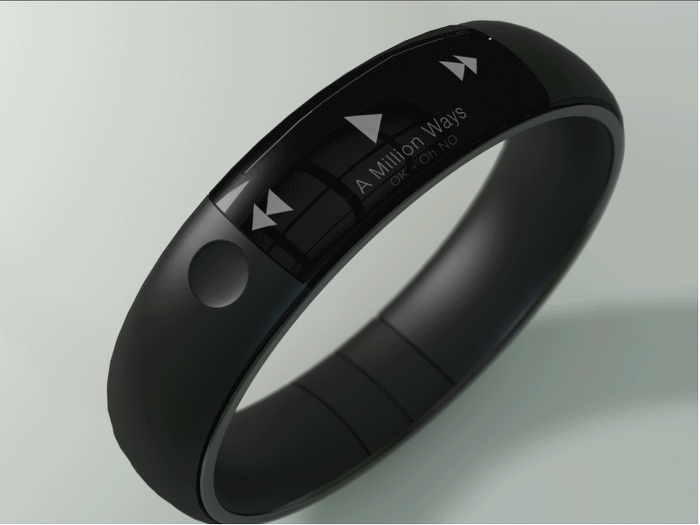
Many interesting iWatch concepts have popped up on the web over the past few months; however, there seems to be a common trend with most of these mockups: they look a bit bloated.
Dribble user Thomas Bogner seems to have gone against the trend to make one of the few iWatch mockups I actually like, and would probably wear.
His design shows what he calls “the bastard child of a Fuel Band and an iPhone.” That’s really what it is as the watch shows a Fuel Band-like wristband with a thin screen that displays the time, music information, and text messages.
The watch looks very minimal, clean, and comfortable. It’s also probably the best use for a curved screen that I’ve come across.


