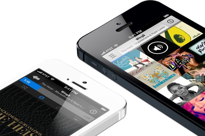
With rumors of an iTunes streaming service in full swing, it’s only appropriate that a new, flat-ish concept for the iOS music app hits the web today. Brye Kobayashi, over on his blog, has put together one hell of a concept for the music app in iOS. It’s not as flat as many are getting hyped up about, and it’s probably a lot closer to what Apple’s thinking, considering the WWDC app that just went live. Kobayashi’s concept is absolutely worth checking out. Above is a preview of his work, but it would be unfair to steal all of his images and run them here. Click through and check the rest of it out.
There’s a lot of hubbub about whether or not WWDC will bring with it an announcement of a full on music streaming service, à la Rdio and Spotify, and I’m all in if it happens. I already have an Rdio account (which I may actually stick with), but given Apple’s catalog of music, it would be hard not to at least try it out. I already pay for iTunes Match, and I’m hoping the streaming service would be tied into that price in some way. Who knows. Just guessing at this point.
Hat tip to Tyler Copeland for sending this one in to us…


