If you’ve begun to find scrolling through your Facebook feed as more of a chore than a pleasure, perhaps the company’s newly unveiled app will help spice things up.
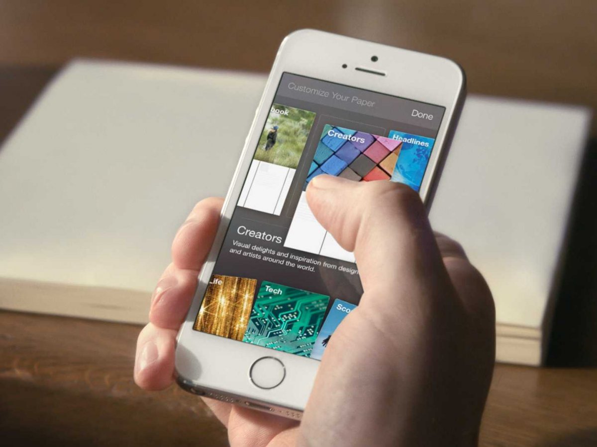
The app is called “Paper”, and it provides an entirely new way of interacting with your Facebook feed. The design focuses more on presenting content as though each post were an individual “story”, displaying them in full screen with no outside distractions. Instead of scrolling through an endless vertical feed like before, the user now flips between simple one page stories.
It’s much easier to see than to describe. Fortunately, Facebook released a video of it in action:
Facebook also has a website where you can click through the different features and see a tour of what it’s like. One thing that everyone can be excited for is that the app will be launching without any form of advertisements.
- Everything responds to your touch so you can pick up or thumb through stories with simple, natural movements
- You can tilt your phone to explore high-resolution panoramic photos from corner to corner, and see faces and other important details up close
- Fullscreen autoplay videos come to life and bring you deep into the action
- Beautifully detailed covers make it easy to spot articles from trusted publishers and decide what to read or watch.· Articles unfold in the app and appear fullscreen for a focused reading experience
- When you’re ready to tell your own story, you know exactly what your post or photo will look like because you see a live preview before you share it
Facebook says that the app will be hitting the App Store on February 3rd, exclusively to U.S. residents. It’s unclear when, or if, the app will be expanded to other regions.
Paper will be the first product to have come out of Facebook Creative Labs, a division of the company tasked with creating new and innovative things. Hopefully it won’t be the last.


