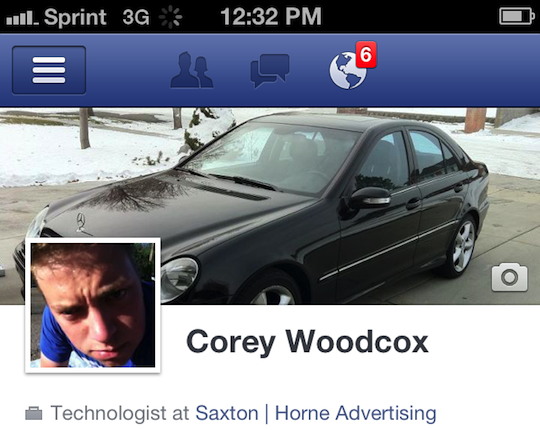
 Facebook’s opened up their new Timeline profile styling to the whole world, and as usual, no one really likes it. Rather quick on the uptake, this time, it’s also rolled out the new Timeline to iOS within the week, with version 4.1 of Facebook for iOS.
What’s new
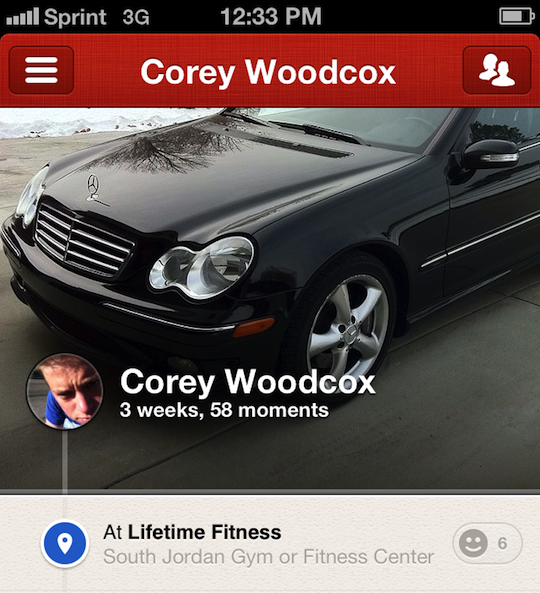
Yay! Timeline! You can see a snippet of mine on my iPhone above. What’s odd is that it looks strikingly similar to my new favorite app, Path, who beat them to the release punch by about 3 weeks. If you haven’t installed it on your phone, go do it. Right now. I’ll wait right here.
 Pretty interesting, eh? I’m not pointing fingers at anyone for copying, and I’m not going to try to hide who I think does it better (Path), I just thought I’d point it out.
Among other neat new stuff is the ability to see and use your friend lists, if you have them, and the ability to see your subscribers, if you’re famous like I am.
What’s missing
iPad support! There’s nothing that irks me more than an app that offers an inconsistent experience across devices. This has bothered me ever since we got new new Twitter, and it bugged me for years that Facebook didn’t make an iPad app. It’s really not that hard, developers, for the love of all holiness, PLEASE make your apps universal and consistent.
Overall, I feel very ho-hum about this update. It’s got Timeline support, something I don’t really care about. I was psyched when they announced it, but it looks like it will take a lot of work to get mine to look as awesome as the Zuck’s did when he demoed at f8, work that I really don’t want to have to do. Zach Holman had a good bit to say on the subject, and I agree completely.
How do you feel about Timeline? Yell at me in the comments. I’d love to hear what you have to say.


