Last time I reviewed a niche photo-editing app for the iPhone, I went in not expecting too much out of it and was pleasantly surprised with how entertaining I found it. So, when I put on my reviewing pants and settled into my easy chair on a rainy evening to dig through Dash of Color, I was hoping for more of the same.
I got exactly more of the same, except replace “quirky fun, nostalgia, and solid design” with “despair.”
Dash of Color takes any of your photos, converts it into Black and White, and then lets you selectively add color back to portions of it using your finger as a stylus. The only two tools at your disposal are “Gray” and “Color”, as well as the option to change brush size. Thankfully, the app also features unlimited undos, and you’re going to need them.
Ok, first things first. The human finger, for all of it’s many uses, SUCKS AS A PRECISION POINTING DEVICE. There’s a very good reason why ballpoint pens measure 1 or 2 millimeters across at their tip. There are also very good reasons why anyone over 5 years old doesn’t fingerpaint as a hobby. My sausage-like index finger, broken twice as a result of years of basketball coupled with general clumsiness, is over one centimeter wide at it’s tip. This, as you might imagine, makes trying to trace around the inside edge of a nebulous shape in a photo somewhat difficult.
Here’s an experiment for you to try. Pick up your iPhone. Right now. Hold it in your left hand. With your right hand, touch a spot on the screen about an inch below your carrier’s name/signal strength meter. Now, when you look at your iPhone screen, what can you see? If you’re anything like me, you can see more of your finger and the back of your hand than you can see of your actual screen. Maybe I’m spoiled from years of Photoshop use, but completely obscuring the area you’re trying to color doesn’t exactly strike me as a shortcut to awesome.
Alright, the limitations of human anatomy as drawing instruments aside, how does the app itself work? Unfortunately, it’s got it’s own share of flaws, ranging from “merely annoying” to “I can’t believe someone thought this was a good idea.” Ranging from least to most severe:

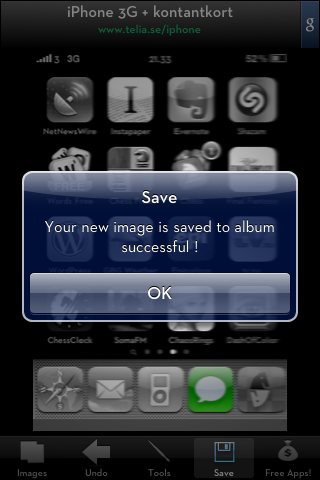
- Poor English translation. I get it, not everyone in the world is a native English speaker. As an English-only speaker in a non-English country, I understand the difficulty with learning new languages. The average Swedish resident makes me feel like a mouth-breathing Monopoly AI opponent every day by the sheer number of languages they can speak fluently. Still, could it have been that difficult to find an English speaker on the internet to proofread the one single sentence that appears in your app?
- Ad placement. Yes, free apps need a way to make money, but in a photo-editing app where every pixel of screen real estate is potentially crucial, a persistent ad across the top of the page at all times is unnecessarily bothersome. I believe this also contributes to the next point.
- Image resizing. Possibly due to the decreased size of the work area because of the ad mentioned above, when Dash of Color saves out your edited image, the resulting image is slightly smaller than the original. This, alone, wouldn’t be such a huge deal if it weren’t for…
- Image quality. Perhaps the most egregious error a photo-editing app can make, the finished photos are saved as JPEGs at an absolutely abysmal quality level. If there’s an option to change that somewhere, the developer did an incredible job of hiding it. Saved images also all seem to sport this spring’s new fashionable look of a 1px white vertical line down the right side of the image. Take a look for yourself:
 In the end, Dash of Color is a neat idea that falls completely flat in almost every single way. Maybe future versions will address some of the issues with the app itself, but until such time as the devs manage to find a way to make my hands see-through, I don’t see this one going anywhere other than my “Deleted Items” list.


