![]() Whether you’re working a 9-5 or dating a member of Destiny’s Child, everyone has bills to pay. With that in mind, iBear LLC set out to create an app with a function that would appease just about everyone: a way to plan and track your bills and expenses. Available for the iPhone ($1.99) and iPad ($3.99), Bills is designed let you do just that, from the comfort of your virtual office.
Whether you’re working a 9-5 or dating a member of Destiny’s Child, everyone has bills to pay. With that in mind, iBear LLC set out to create an app with a function that would appease just about everyone: a way to plan and track your bills and expenses. Available for the iPhone ($1.99) and iPad ($3.99), Bills is designed let you do just that, from the comfort of your virtual office.
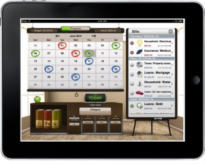
Bills is fairly simple in design, with most activity centering on a nicely designed calendar. The process is simple as well. You select a date, pick a category, add the amount of your bill and you’ve now added a new bill to the “planned category”. Later, once the bill is paid, you can approve the transaction moving it from “planned” to “paid.” Once your bills are added, you’ll have a nice calendar showing what’s due when, and a handy indicator showing your progress on “planned vs. paid” expenses.
What’s Macgasmic:
 If you read through the iTunes description for Bills, you’ll notice how much attention has been paid to highlighting the app’s design. In this area, Bills definitely delivers. While you’ll still get the pretty interface and smooth transitions on the iPhone version, the extra screen size of the iPad really lets Bills shine. Styled after a typical office, Bills displays the calendar as a projector, your settings in a bookshelf, categories in filing cabinets, and your list of bills on an easel. It’s a nice touch, and can take some of the monotony away from planning and tracking those pesky expenses. The design is complimented by nice use of color and vibrant icons to represent each category of bills and expenses.
Bills also brings a few helpful features including bluetooth sync between the iPad and iPhone, the ability to add a security PIN, category customization, push notifications, and the ability to export to CSV.
What Needs Work:
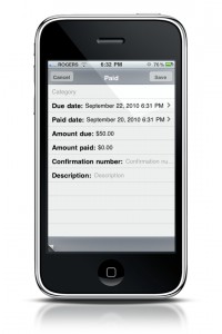
 What Bills makes up in design, it lacks in functionality. Things start out rough from the minute you launch the app. While it’s fairly straightforward to add bills and expenses, Bills offers absolutely no tutorial or initial setup screen when you launch. You’re greeted with a view of your office, a calendar, and that’s just about it. Not unlike a typical first day at some companies. Things get worse from there with sloppy coding requiring the app to skip past one screen to get to the next, leaving you feeling like you’ve done something incorrectly. Adding bills isn’t complicated, but the interface could be laid out in a much simpler format with certain fields only showing up when needed (like asking for a confirmation number even for “planned expenses”). Also, as simple as it is to mark an expense as paid (tapping the checkmark beside the expense), it was less obvious how to undue this easy to make mistake (editing the bill, then selecting the newly available “paid” checkbox.” While the interface isn’t awful by any means, a few functionality mistakes really hold this app back.
Final Thoughts:
There are still a few features that could be added in future releases, such as iCal and Google Calendar sync, expense charts and history, and more customizable notification options. If you are sensitive to interface issues, it may give you a few moments of unnecessary stress. If you need a more robust solution then there are much better options. Overall though, if you’re looking for a simple app to track your monthly bills and aren’t too picky about the interface, I could recommend you give Bills a try.


