As some of you may know, when I’m not writing for Macgasm, I’m designing websites for people and companies all over the world. As a web designer, I spend an awful lot of time writing code. I also get to know the technologies used in the development of websites intimately. For years, Adobe Flash has been the dominant way of producing animated interactive content on the Internet. It’s a pain to work with, extremely difficult to learn, very resource intensive, and riddled with security holes and instability issues. Therefore, web designers all over the world have been eagerly awaiting the arrival of a compelling alternative to Flash, built with modern open web standards. Until now, there really hasn’t been an integrated solution capable of producing clean, code-based animations for the modern web.
Everything from banner ads to online games and website intros has been built in Flash for years. Apple has worked on eliminating Flash, both by refusing to include it with iOS, and now by shipping Macs without Flash installed by default. Additionally, the company has innovated in the advertising space with their iAds platform, which is based on modern technologies like HTML 5 and CSS 3, as opposed to Flash. This is very good to see, but it does not solve the bigger problem. We’ve long needed an integrated solution for creating animated content for the web, and so far Flash has been the only one available — not a good situation.
Now that we know the background of animated content on the web, we see that Hype is up against a colossal and well entrenched incumbent player. It looks like the folks at Hype are well aware of this, and have wisely decided not take on Flash head-on. Instead, they’ve built a powerful and compelling, yet humble alternative that does much of what Flash does, better than Flash. It does not even try to do everything Flash does, and that’s a good thing. It doesn’t need to, and they know that. That said, it is missing some key features, such as support for vector drawing and editing, easing in and out of keyframes, and some other things of that sort. However, Hype is a 1.0 product. If Hype is this good now, we can only imagine how powerful and compelling it will be after a year or two of customer feedback and full-speed development by their obviously skilled team of developers.
The folks at Pixelmator have done the same thing with Adobe Photoshop, choosing to build a lightweight and easy-to-use alternative (as opposed to competitor, per se), and not trying to emulate every single feature that Photoshop has to offer. This worked incredibly well for Pixelmator, and it became massively successful as hobbyists and professionals alike have come to love it. They also followed the release early and iterate strategy — one learned from Google and tested on products like Gmail and Chrome. This appears to be the strategy of the Hype team as well, and time will tell how well they continue to iterate on the app.
In my opinion, Hype is trying to achieve roughly the same effect as Pixelmator, and that is exactly why I think it will succeed. So to clarify, Hype is not trying to replace Flash any more than Pixelmator is trying to replace Photoshop. Instead, they are simply saying, “Hey, we made this cool app. Come check it out!” All the while, they are fully aware that for many, Hype may indeed replace Flash altogether, once they try it out and see just how well it fits into their workflow. This is possible because many people (most people actually) only use a tiny percentage of the features of behemoth apps like Flash and Photoshop.
So, how does it work in practice? That’s the question we’re all asking. To find out, I contacted the folks at Hype, and they were kind enough to send a review copy for testing.

When you first open Hype, you’re greeted with a window from which you can view video tutorials and other training information to help you get up to speed with the app. This is useful, because obviously the whole app is brand new, so you’re going to be figuring everything out from scratch. The tutorials help to ease the learning curve a bit, and make it easier to dive into the app and see what it’s capable of.
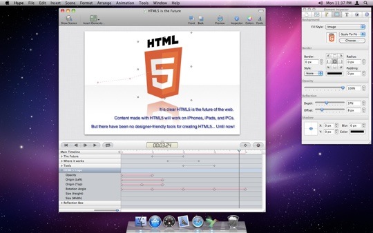
If you’ve ever used Flash, After Effects, or Apple’s own Motion app, you’ll be familiar with the concepts Hype was built on. Hype uses a “stage,” which is the workspace on which you build all your animations. You’ll want to set this to match the size of your intended final product (banner, intro header, page, etc.). Below the stage in the main window is your timeline. This works on the well-established concepts of keyframes and layers. If you’ve used Adobe After Effects, Hype will seem extremely similar. You immediately begin to feel that the app is more of a video and motion graphics app than a web design app in how it operates.
Everything you make in Hype is a carefully choreographed performance, with the elements of your design coming onto the stage right on queue. You can “tween,” (animate) objects by adjusting their opacity, position, size, and other attributes, and then clicking the diamond button in the toolbar above to set a “keyframe.”
Keyframes are like waypoints, telling your objects that you want them to be at a certain location on stage, with their attributes set a certain way, at a specified time. For instance, you can set a text object to be off-stage to the left before the animation begins, at 0% opacity (fully transparent). Then, you could drag your timeline forward one second, drag the text to center stage, at full opacity, and set another keyframe. This would make your text fly across the stage, fading in as it goes, finally settling into the center at full opacity one second later.
You use this same method of interacting with each of your objects, whether they be buttons, links, text, logos, images, or even videos! In this way, you can eventually end up with a beautifully choreographed animation sequence, in which all the elements of the design animate in, out, and around the stage at the waypoints you set for them. And most impressively, this is all done in clean, modern HTML5 and CSS3, which means it works on devices like the iPad and iPhone that don’t support Flash.
These code-based animations also consume far fewer resources when run on any device. This is because executing code in a browser takes far less processor power and memory to run than running in a big, bloated plugin like Flash does. And, while we’re on the subject of lower resource requirements, Hype has an interesting feature to deal with mobile devices and diverse browser capabilities as well. It allows you to target specific devices, platforms, and browsers by simply checking them in a list before you export your finished project. This guarantees functionality on those devices, platforms, and browsers you choose from the list. You can even choose all of them, which is actually the default setting.
When you’ve finished building your animation, you can click the “preview” button to open your animation in your default browser, to see how it will look and perform in the real world. When you’re satisfied with the animation, you simply export it from the “File” menu, using the “Export as HTML5” command. Hype then generates all the animation code for you, creating a folder with all the files inside. There is even an option to save the folder to your DropBox account automatically — a nice touch.
There really isn’t much more to it. Hype is really that simple. Drag and drop your objects, set their keyframes and attributes, and voilà! You’re good to go. Previously, creating things like this in code took a high level of previous technical knowledge and experience, not to mention a large amount of time. Even those who would rather hand-code everything can appreciate the value of saved time and work. Time is money, after all.
I can see Hype being used to accomplish a lot of great things in the future. Unfortunately, I can also see it being used to create a lot of garbage. One of the side effects of making something so empowering so easy to use is that you often end up with people who have bad motives or awful taste creating things just because they can, rather than hiring a pro to do the job correctly or passing on the job altogether. Tools that combine power and ease of use into a single product have historically been plagued with this problem. Just think of all the awful designs you’ve seen done in Microsoft Word, or worse yet, in Photoshop Elements, by people who thought that having a tool instantly qualified them to do the work.
Sadly, we may be seeing a lot of horribly ugly and annoying HTML5 and CSS3-based banner ads and animated popup windows, created by people using Hype. It’s just so easy to use that it may keep many people from hiring the right person for the job at hand. Just remember that a powerful, affordable tool is never a substitute for professionalism, skill, and good taste.
The beautiful flip side of this is that tools like Hype make the jobs of professionals a lot easier, should they choose to use what’s available to them. Additionally — and perhaps more importantly — tools like this make it easy and appealing for young, motivated creative people to enter the design and animation fields, and that’s always a good thing. Most professionals got their start using easy-to-use software that inspired them, and Hype certainly fits the bill. Here’s to a bright, animated future of the web and the discovery of new, yet untapped talent being discovered because of tools like Hype.

Hype looks to be off to a great start. It’s already one of the highest-grossing apps on the Mac App Store, where it retails for an introductory price of $29.99.


