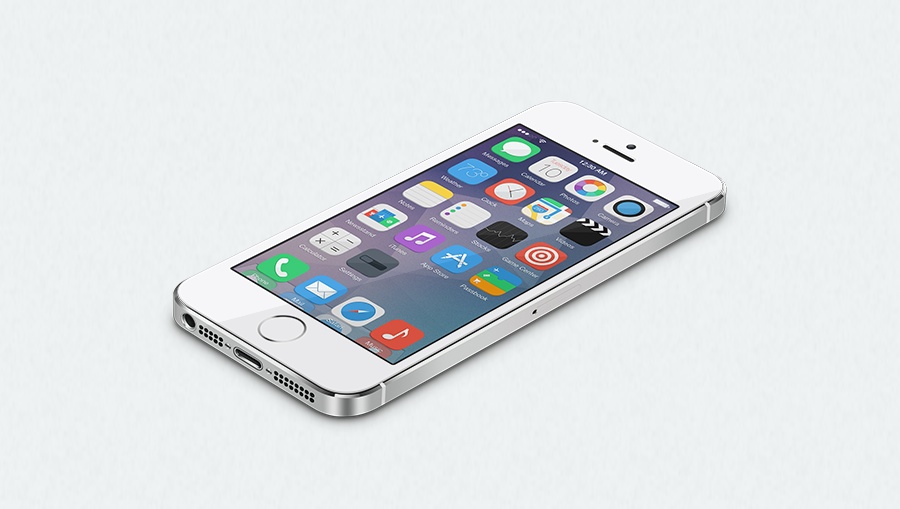
We’re not big on publishing concepts these days, but this one was too good to pass up because it illustrates that flat design doesn’t exactly have to mean crap design. With word surfacing that iOS 7.1 beta 3 has begun to introduce some new UI elements to the OS, it’s an interesting time to look at some new home screen icons and concepts for iOS.
The iOS 8 Infinity concept leans heavily on Google’s iOS icon design philosophy, but it also adds more pop to an operating system that seems to have overextended the flat motif this time around. Nico Achkasov has done a superb job this with this re-imagining.
Design elements and concepts are rife with passionate, personal opinion and theories when it comes time to discuss what we’re looking at, but I can’t help but find myself intrigued for what iOS 8 may have in store for us this time around. This concept has me wondering for the first time what iterations Apple’s going to implement in newer versions of iOS, and whether or not we’re going to see some drastic, but minimal changes to its flat philosophy.
It’s fun to think about, and honestly, it’s been awhile since I’ve found this sort of thing intriguing. Anywhoozle, here’s the concept page. It’s worth checking out a bit more in depth. The designers have also released two wallpapers for you to download if you’re into that sort of thing.


