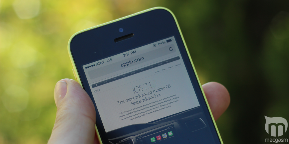
iOS 7.1 is here, and while it doesn’t look drastically different from iOS 7.0, it addresses many of the complaints that people had about its predecessor. Here’s a quick tour of some of the tweaks, changes, and additions we’ve spotted in our adventures with iOS 7.1 so far. We’ll add to this list as we find more things.
Table of Contents
Higher-Contrast Keyboard
The keyboard get a new-ish look in iOS 7.1, but you may have to look closely for it. In iOS 7.1, keyboard lettering is heavier than it had been on 7.0, and the background is a slightly cooler shade of gray. The Shift key gets a new look, too: When Shift is on in 7.1, the key turns white with a black arrow. In 7.0, the key remained gray, but gained a dark gray arrow.
Tweaked Icon Colors
iOS 7.1 slightly tones down the green icons for the Messages and Phone apps. The rest of the bundled app icons are largely unchanged, but eagle-eyed readers might also notice that the icon labels are slightly lower relative to the icon they’re associated with in iOS 7.1.
(What, you didn’t notice it? Some iOS user you are. :P )
Make Buttons Look Like Buttons
iOS 7’s borderless buttons caused…just a little bit of a stir among the user interface design community. And for good reason—some buttons may be hard to distinguish from mere text labels, particularly if you have a vision impairment (like colorblindness) or are just unfamiliar with iOS. iOS 7.1 gives you the option to re-add borders to buttons: Open the Settings app then go to General > Accessibility, then toggle the Button Shapes setting to the on position. The button shapes aren’t pretty, but they work.
Cut Down On Gratuitous Animation
iOS 7’s animations aren’t for everyone. For some, they’re annoying. For others, they actually cause motion sickness. Previous versions of iOS 7 could reduce some of the motion effects, but as Macworld points out, iOS 7.1 takes it a step further by optionally disabling additional visual effects, such as the scrolling effect in the Messages app and the cloud animations in the Weather app.
Open to the Settings app, then proceed to General > Accessibility > Reduce Motion to make sure that you don’t lose your lunch over zooming icons. Unfortunately, you can’t turn off only certain effects while keeping others.
Darker “Slide To Unlock” Text
It’s a small thing (as are all of these—noticing a pattern?), but the “Slide to unlock” text on the lock screen is darker and a bit more obvious under iOS 7.
Tweaked Dialer Screen
The dialer screen in the Phone app gets a minor update in iOS 7.1: Instead of a rectangular button labelled “Call,” you now get a circular button with a phone receiver icon (how quaint). The top bar that displays the number you’re calling gets a slight update too. (Note that the iOS 7 screenshot above is from an iPhone 4 so the proportions may be different from what you’ll see on an iPhone 5/5C/5S, but the basic layout should be the same.)


