 I’ve been looking for an app that allows me to track my spendings while I’m on the road, ever since I got my first iPhone. With Expenditure, I finally found what I was looking for! It has a beautiful interface, it’s easy to use and comes with almost every feature an app like this needs.
The first time you start Expenditure, you’ll get a guided tour through all the features. It gives you a good idea of what the interface looks like and what’s to come. I love it when developers provide assistance like this. It makes an app feel so much more well-engineered.
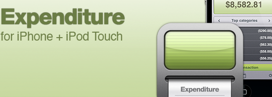
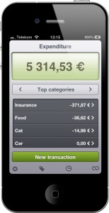
Expenditure’s main interface displays your current balance in a monochrome-like style. It looks very nice and reminds me of an old calculator. Below the balance is a list of various transactions, which you can filter based on criteria like “Top months,” “Top categories” and “Recent transactions.” It’s a shortcut to the most important information, which are your transactions. Tapping on an entry brings you to a beautifully detailed view of a transaction. It looks like a paper slip of an old calculator.

Each transaction can be categorized, aka tagged, provided with a note and a picture, as well as a date. The most important categories like “Food,” “Gifts” or “Electronics” are already provided. Categories and dates can be used to sum up your transactions and give you an idea of whether, for example, you are spending too much on candy bars every month. The monthly overview can also be used to export your spendings as a CSV file via email.
That’s actually the only real complaint I have with Expenditure: exporting your tracked spendings! Sending a CSV file via email definitely works, but it’s not really comfortable. I wish there was an Expenditure Mac version that the iPhone App could sync with.


