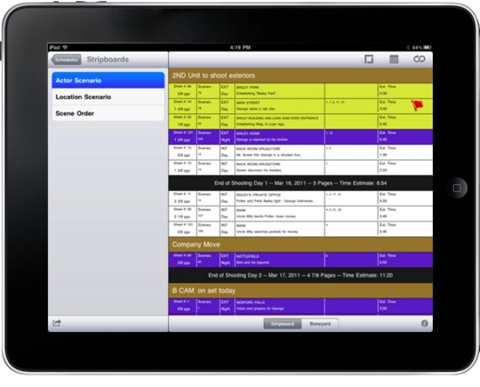
Most Macgasm readers aren’t interested in filmmaking apps, so with this review of Movie Magic Scheduling To Go for iPad, I first want to address what the mere existence of this app means, or at least what it should mean.
The Applesphere has been inundated lately with articles noting the rise of the iPad in the enterprise environment (links 1, 2, & 5). As Patrick Rhone points out in the Minimal Mac podcast episode 19, iOS’s consistency across devices, lack of crapware and malware, and resistance to viruses make it an ideal candidate for businesses looking for a touch-tablet/smartphone solution.
But there is another factor for the rise, one that even affects small businesses all the way down to sole proprietorship. One of the primary driving factors for the adoption rate of the iPad is… the adoption rate of the iPad. Apple announced during last month’s conference call that they’ve moved 19 million iPads in the first nine months. Early assumptions regarding the iPad 2 show equal or greater popularity, and their owners are demanding apps for their industry.
When it comes to technology, adoption rate drives adoption rate. Consider one of the simplest of technologies, the alphabet. Everyone learns to use it because that’s what everyone else already knows how to use. While today’s gadget market may feel a bit Tower of Babelish, developers are affirming again and again that iOS is the place to be to connect with users (and their cash). As a result, the truly innovative apps and services are coming primarily from the iOS developer community.
So in response to this huge surge in iOS users, developers that might otherwise use other methods are forced to use a ‘limited’ toolset in order to comply with App Store rules.
The Movie Magic Scheduling and Budgeting desktop apps have been developed in Java in order to facilitate reaching both PC and Mac users. I see how this is great for developers, but it’s not necessarily great for users. While I’ve always loved what the Movie Magic products have been capable of, I’ve always felt the interface was clunky, flimsy, and just in general not very fun to look at.
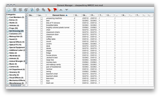
The headings on this table are unreadable, and the UI looks more like something from Squirrel Webmail than from a 2011 OS X application.
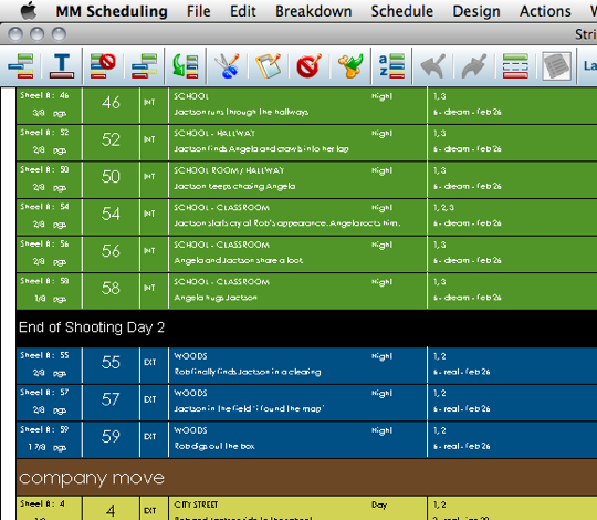
Even basic things like fonts work poorly in the MMS Java-based desktop app.
To have the power of Movie Magic Scheduling in a native OS X application, Entertainment Partners would have to do a complete rewrite of their very popular software. That doesn’t happen often, but it’s not unheard of. I think one reason MMS users clamored for an iPad app the day the iPad was announced is because MMS users envisioned using this software in a way they liked to work, on technology with which they desired to work. The days of clumsy Java apps would fade away as technology is becoming driven by user demand for innovation.
MMS To Go is by no means the first app to demonstrate these expectations, but it’s the one that applies to MY business. So that’s the good news. The bad news? Eh… it’s pretty useless. And it’s thirty bucks. If you’re interested in the app-specific details, read on. Otherwise, skip to the end.
Revisions Only
“It’s clearly a BLUE schedule and beyond app.”
– M. Ryan Traylor, Assistant Director
That’s a quote from a film friend of mine working in LA as an assistant director. He uses Movie Magic Scheduling nearly every day. An original schedule is printed in white, then revisions are in a succession of colors, beginning with blue. His point here is that this is only for modifying completed schedules. Honestly, I feel this is the “it’s a feature!” way of saying, “not what I wanted.”
Frankly, even as a BLUE+ schedule app, it’s still pretty clunky. E-mail and iTunes are still the only official way in and out of the app. Luckily, Dropbox (how I manage all of my production data) has “Open In…” for nearly everything on your iPad (just like e-mail), but that’s really points for Dropbox, not MMS.
The main point here is there’s no syncing. When you make changes you create entirely new files. Not a huge problem; what is a problem for me is that to change a stripboard, you permanently modify it. No duplicate, no add new, nothing. What you may have called “White Schedule” is still called “White Schedule” no matter how many revisions have been made.
The reason this is a problem isn’t due to it being a scheduling app or having some proprietary format; this is a problem because no one at EP picked up any number of editing/creation apps and stood on the shoulders of what many people have been doing for over a year (or longer if you count iPhone). And you’d think someone over there might have heard of Dropbox.
MMS To Go Features Scorecard
Here are the features of Movie Magic Scheduling To Go, according to the website. Below, I’ve rated them one by one on a scale of zero to five, five being as or better than expected.
View Stripboards — It is actually rather handy for this. Since you can change calendars and layouts on the fly, it may be better than PDFs for some. I’m usually done futzing with calendars and layouts by the time production begins though, so this isn’t incredibly magical for me. Personally, I like to use old-school vertical strips; MMS To Go only uses horizontal layouts. 3 (while this is one of the higher ratings, bear in mind that ‘looking at the data’ is the main feature being touted here.)
![]() Move strips and banner strips — It does this. You can only move one strip at a time. Rain day? Moving whole days around? This is probably the worst way to do it. Unfortunately, I see this as one of the better features of the app. 3
Move strips and banner strips — It does this. You can only move one strip at a time. Rain day? Moving whole days around? This is probably the worst way to do it. Unfortunately, I see this as one of the better features of the app. 3
Delete and add daybreak and banner strips — Note that daybreaks are not included in the ‘moving’ features above. You can’t move a daystrip. If you want to move daystrips, you have to move all the strips associated with it one at a time and/or delete the daystrip, then add a new one. Why daystrips don’t function like banners is beyond me. While creation of daystrips worked fine in the demo version, in a personal schedule I imported, it completely malfunctioned, adding new daystrips at the top of the schedule — a big problem since they are immoveable. Also, exporting that altered schedule back into the desktop version produced an entirely incorrect strip order. 1 (only because it worked with the demo)
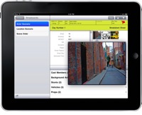 View Breakdown Sheets with images, and full scene details — The ability to tap on a strip and see the breakdown sheet, photos, and all scene data is the only truly useful part of this app. The data, unfortunately, is not editable in any way. 4
Send unused strips to the Boneyard — Seems to work fine, although note that bringing things back from the Boneyard sticks them at the end of your schedule, where you can only move one strip at a time. 4
Save and create multiple versions of a schedule — Okay. So, it *does* do this, but not in any way you’re thinking by reading that description. It DOES allow you to save out a modified schedule, thereby creating a new version of an existing schedule. While that fulfills the letter of this ‘feature,’ you should not expect anything beyond that. You CANNOT duplicate a project within the app. You CANNOT duplicate or create new strips within the app. Modified stripboards ARE NOT renamable, and editing an existing strip board is destructive. The only thing this ‘feature’ describes is one of the biggest inherent flaws to the app — the lack of syncing. 0
View scheduling conflicts with Red Flags — Really? I’m always irritated when special features exist in an app that doesn’t get the basic ones right. I have no idea what this is or if it even works, as I was about to throw my iPad out the window after about five minutes of trying to use this app. I guess we assume that it’s awesome and is worth $27? no rating
Switch between calendars — It works. I can think of few reasons why I’d need this on set, but it works. 5
Change appearance of Stripboard through built-in and custom strip layout options — The description here is poor. You cannot edit layouts within the app. You can send custom layouts (again, only horizontal) to the app, but they don’t fully work. In the image below, I’ve added script day to my horizontal layout, as it is critical for the short film we were shooting. It works fine on the desktop, but doesn’t show up at all on the iPad, making MMS To Go useless for this film, even as a schedule viewer.
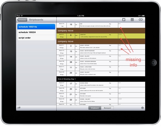
Again, once I’m on set, I’ve decided on a layout. If I need another one, I need to edit the layout, not just flip between defaults. This feature works; I just don’t see why anyone would use it a lot. 2
Save and export schedules back to the desktop application — It does do this, though as mentioned before, my personal schedule was a mess on the trip back in. 1 (since it worked with the demo)
Conclusion
I try so hard to be positive in reviews. Rarely do I find it useful pointing out the negatives where a developer has worked very hard to produce something he thinks is useful to someone out there.
But Entertainment Partners is coming into this game a year behind a lot of people who have made better, more robust apps while being broke college students. EP is a major player in the film industry. Every production person I know uses Movie Magic Scheduling. Desktop products aren’t cheap, and we professionals gladly pay for the power of data organization that they provide. Customers have been clamoring for an iPad app to assist in production, and only now do we finally get what we’ve waited for, only to be disappointed.
My hope is not that Entertainment Partners will be discouraged by this review, but rather use it as a wake-up call that they need a new vision for their software to compete in this new era of technology. Lion is just around the corner, and Rosetta dies with it. Movie Magic Budgeting requires Rosetta support. How long before there’s no Java support on the Mac? Please EP, I think I speak for many of your users when I beg of you, please develop native MMS & MMB apps.
With apps like Artemis Director’s Viewfinder and Cinemek Storyboard Composer out there (from MUCH smaller companies), there is no excuse for an app this flimsy to come from one of the leading software companies in the film industry. The app does very little, doesn’t do most of that well, and if Entertainment Partners doesn’t develop an Apple-esque vision for its products, someone WILL come along and usurp them in the iPad age, industry-standard or not.
The ONLY reason I recommend paying $30 for this app is that once it becomes something useful, EP will likely raise the price to $60 or $100. Of course, that may be another year and a half from now. Don’t buy this app. Instead, go to my blog and download the parabolos Dropbox System (for free – hooray!) and just use PDFs.
![]()
![]()
![]()


