Instagram has finally done it. After more than a decade of users asking, the company has rolled out an official iPad app. The iPhone got Instagram back in 2010, but iPad owners were stuck with the stretched phone app or the web version ever since. As we reported in our earlier coverage that Instagram on iPad could arrive before the year’s end, the prediction turned out right.
The app is live in the App Store, built with the bigger screen in mind, and it puts Reels front and center. Let’s take a look at why it took so long and what it actually offers.
Table of Contents
Why Instagram Took So Long to Make an iPad App and Why Now?
Almost from day one, iPad users asked when Instagram would make a version for the bigger screen. For years, the answer was some mix of “not a priority” or “not enough resources.” Instagram’s head, Adam Mosseri, went on record more than once saying the iPad crowd just wasn’t big enough to justify the effort. In early 2022, he even told YouTuber Marques Brownlee that while an iPad app would be “nice to do,” the team was focused elsewhere.
Yup, we get this one a lot. It’s still just not a big enough group of people to be a priority. Hoping to get to it at some point, but right now we’re very heads down on other things.
— Adam Mosseri (@mosseri) February 27, 2022
So what changed? Two things.
First, the iPad audience itself has grown, and its relevance only keeps climbing. In the company’s 2024 financial year, iPads generated almost 27 billion U.S. dollars in revenue. It’s a product line no one can ignore.
Second, TikTok’s dominance in short-form video and the political uncertainty around its future in the U.S., gave Meta a clear reason to double down on Reels and make them available everywhere. A Reels-first iPad app makes sure Instagram can capture attention on larger screens and stand ready as the obvious alternative if TikTok stumbles.
Instagram iPad App Features Explained
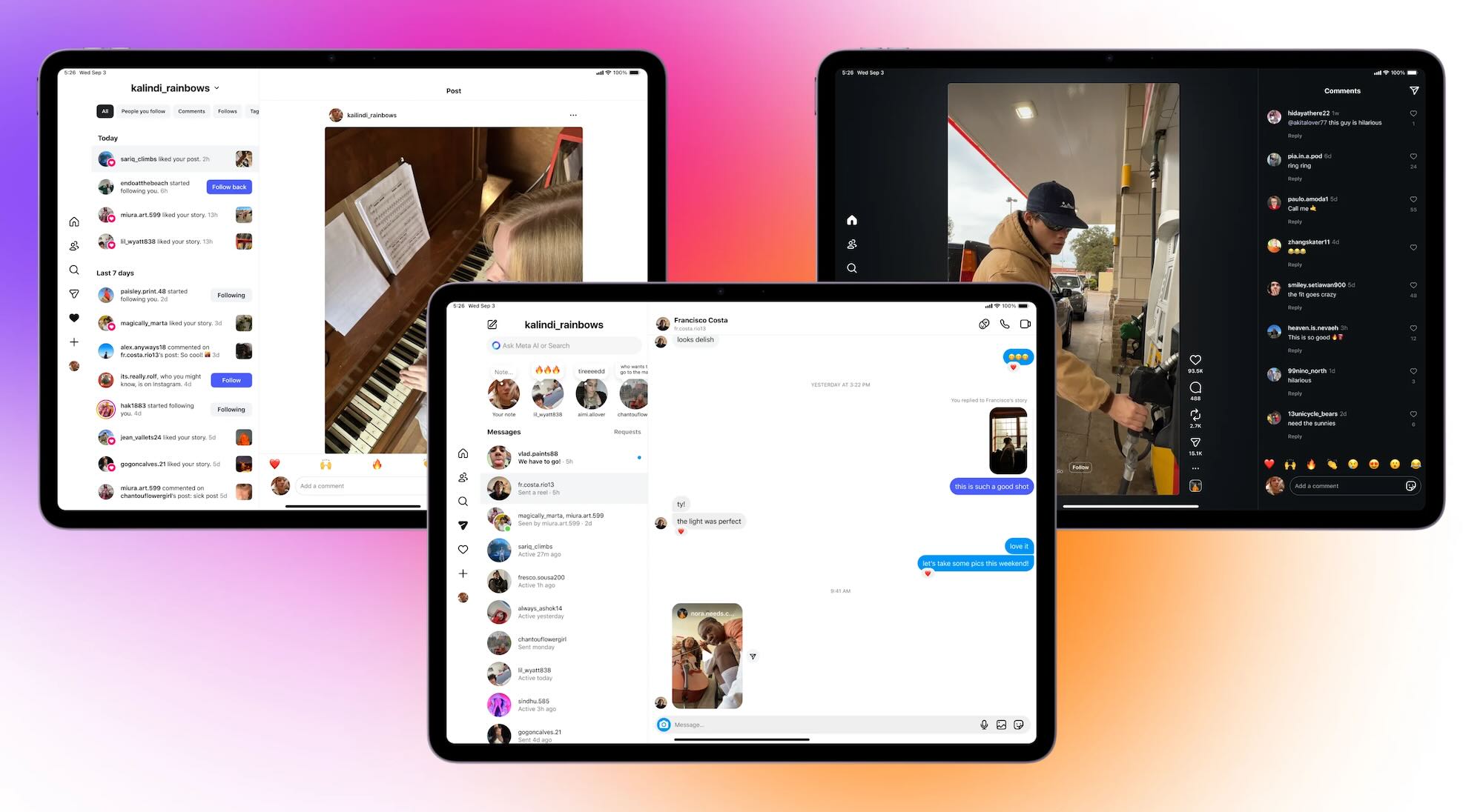
The new iPad app isn’t simply the old iPhone version stretched out. Instagram rebuilt the layout to take advantage of the larger display, and as we already said, Reels are front and center.
 Source: Official Instagram Blog
- Open the app and you land right in a vertical feed of Reels, with Stories still lined up at the top. It’s a clear signal of where Instagram wants user attention.
- Navigation also looks different. Instead of the bottom bar found on iPhones, the iPad version uses a persistent sidebar. Icons for Home, Following, Search, Reels, Notifications, and Profile are all there, making it easier to move around without constant backtracking.
- Another major change is how the app handles space. The iPad layout uses multi-panel views to show more at once. For example, you can scroll through a Reel and see comments in a side pane without covering the video, or open Direct Messages with your chat list on one side and the conversation on the other. Notifications and activity alerts follow a similar split view, cutting down on taps.
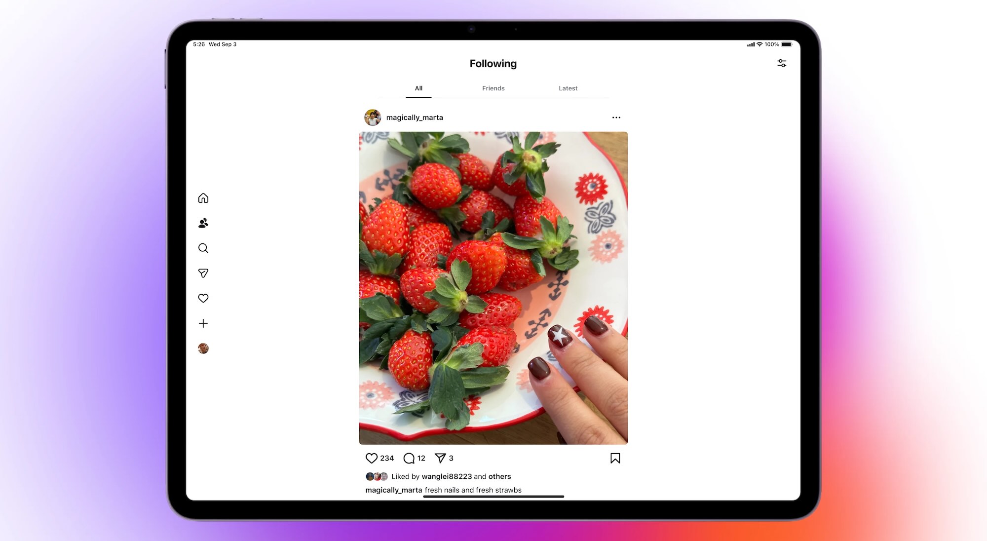
- The Following tab adds even more flexibility. It breaks down into three feeds: All (posts and reels from everyone you follow), Friends (mutuals only), and Latest (a chronological timeline). You can even reorder them so the one you care about most always appears first. That’s a step in the right direction compared to the iPhone app, where switching feeds is hidden behind the logo menu and resets each time.
 Source: Official Instagram Blog
Smaller touches also matter. Uploads finally keep proper resolution on iPad, landscape orientation is supported, and the app works with iPad multitasking modes like Split View and Slide Over.
In short, it’s still Instagram – but with more room to breathe and fewer compromises than before.
Early Reactions
As to users’ reaction to such a long-awaited event, the mood is a mix of excitement and disappointment in current trends.
Instagram just launched for iPad. It’s not April Fool’s Day. What a random drop. https://t.co/ztcQIr9XbA
— Marques Brownlee (@MKBHD) September 3, 2025
But not everyone is thrilled. The iPad app opens directly into a Reels feed, and that decision has already stirred criticism. On Reddit, one user’s first impression was blunt: “Well that’s trash.”
Others pushed back against the short-form-first focus. “Watching reels for an amount of time just gives me anxiety – all that short form content blasted at me feels like I’m living life 3x speed,” one comment read. It’s a concern people voice more often now, as apps push nonstop video to maximize screen time.
But those are bigger-picture problems. When it comes to the iPad app design itself, criticism focused on Meta’s execution. “This is an absolutely shocking attempt at making an iPad app. The amount of white space within the app is ridiculous and is just pure laziness by Meta,” one user wrote.
Final Thoughts
While some users may be displeased with Reels taking all the attention, the developers’ intention is clear – and probably not changing anytime soon. The App Store listing says it outright: “Sit back, relax, and watch Reels.” Instagram sees the iPad as a screen for lean-back video, not just photos and Stories, and the app reflects that shift.
As iPad fans, though, we’ll say this: it’s better to finally have a native Instagram app on iPad than not. After 15 years of waiting, the launch itself is worth acknowledging. Any design quirks or missing features can be forgiven, especially since the app literally just launched.
We’ll be watching closely to see how it evolves, and whether user feedback helps shape future updates. For now, at least, Instagram for iPad is no longer just a rumor.


