Today the BBC’s popular online service iPlayer comes to the iPad — but is it as exciting as we are all hoping?
Well, sorta. I’m excited that they have a dedicated iPad app, but isn’t the website shortcut good enough? Here is a quick run down of what you’ll get…
Table of Contents
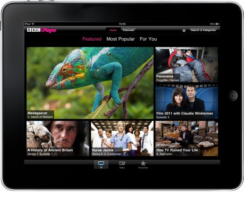
Featured TV shows
This main screen has as a default the TV shows selected, but you can also look at the radio selections or your favourites. In this area you can also have a look at the most popular and it give you three screens of each to navigate through. The visual aspect of this is really good because they have more shows than I remember!
Channels tab with listings
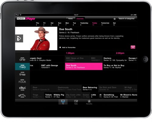
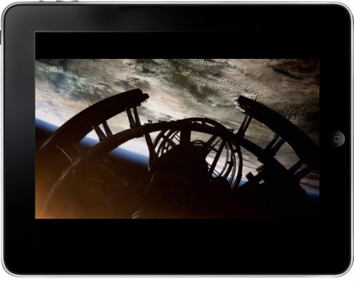
This is good but not as good as I’d want. Within this section some of the programmes are in white text and these are selectable and watchable. The others are greyed out and not selectable, so for whatever reason, you can’t choose them. (Not available to stream?) Once you do click on a show, you also have the ability to add it to favourites or click it directly to view it. It doesn’t play full screen and leaves a small BBC logo on around an inch or so of width on the left hand side. This may be related to certain shows because another one I was watching had the logo in the same position but the show was almost full screen.
This view will show information up to 9 days in advance.
Search & Categories
Here you can look through the variety of shows, sporting events, films etc. This is really easy to look through and when you click through a search area or category you get a large enough picture of the show to recognise it as well as the title. If you do click through to this program you then are also shown related programmes or more show information or again that option to favorite it. You can favourite a show these two ways:

I have to say that when looking through the app and viewing the scrollable (horizontally) area that shows you the TV or radio selections, I really wanted to watch more TV. It’s very crisp and clear, and when I tested it, I had a connection that made the streaming seamless. I was totally impressed.
The Bottom Line
So, who cares that they have a dedicated app when the website has a pretty great iPad friendly site, right? Well, actually, I was totally won over when I wasn’t expecting to be. It makes the website look clunky and awkward, like it’s ugly sister, and I will be removing that homescreen link in favour of this app — no question.
I hope other TV companies / services do the same. It has totally changed my viewing knowing that I can have something so easy to navigate, crisp to watch and easy to mark my favourites. Well done, BBC! I just hope all the other TV license payers are just as happy as I am.
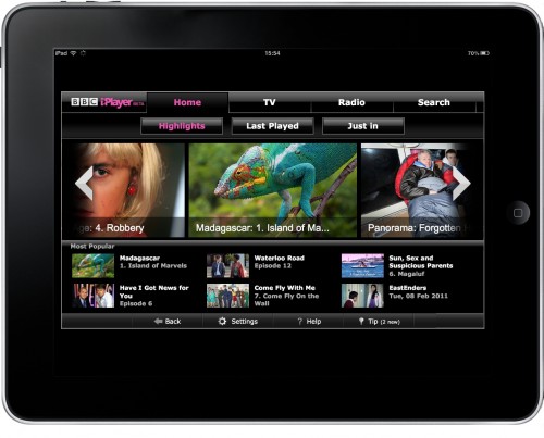
Here is the view of the BBC iPlayer website for your own comparison:
