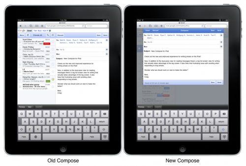
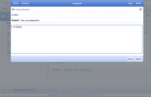
Google announced today that they have updated the user interface of GMail for the iPad. Instead of having a split-view while composing a new message, a full editing screen overlays the inbox to allow you more working space.
If you’d like to try it out on your Mac, go to the Develop menu in Safari, and change the User Agent to “Mobile Safari 3.2 — iPad.” Once that is done, just load GMail like you would regularly, but now you’ll get the iPad interface. Pretty neat, eh?
Do you like this upgrade to the web interface? Do you prefer using mobile GMail to Apple Mail? What would you like to see implemented in the future? Hit me up in the comments or on Twitter.
Article Via 9 to 5 Mac
Photo Credit: Google


