UPDATE: Due to an editing error, we inadvertently posted an older, previously unpublished installment of Apps Of The Week. Most of this post is still valid, but Unread is no longer $4.99: It’s now a freemium app you can download here. The editor has been berated and shamed. We apologize for the mix-up. The story as originally posted follows below.
We’re starting off with a Web app this week that’s a little odd: If you’re not a fan of classic sci-fi or little Flash toys, you should skip right to the second app. You’ve been warned. We also take a look at the latest streaming music site to take on Spotify. Fans of shouting at their phone when they loose it finally have an app that will let it scream back. Our last app is the iPad debut of a design-nerd favorite RSS reader.
Table of Contents
Pixel Trek – Web

Star Trek fans make the coolest stuff to make their sci-fi world of choice more tangible. I think it was the first sci-fi universe to have entire reference manuals devoted to the minutia of the ships and world. Pixel Trek picks up that fine tradition and makes a little version of the Next Generation version of the Enterpise you can explore as Data.
This is the Enterprise done in a pixel-art style, but it’s fairly detailed despite having only two decks. You can see various crew members quarters, and even wander around the bridge and shout “engage” at your monitor.
Not that I did that or anything; that would be nerdy as hell.
Ahem.
To navigate, you use the arrow keys or WASD—simple enough—and as you explore, you’ll see things as detailed as the life pods and uniform storage.
Although Pixel Trek looks like a game, there isn’t much game here. Instead, it’s an entertaining little interactive guide to the Next Generation Enterprise. You can explore all of this in just a few minutes. This stuff is like catnip for Star Trek nerds, and its developer has promised that he will add more content in the future. It’s also really well designed for a simple Flash app: There are no weird stutters or slowdowns, but it will cause your fan to kick up if you’ve got a slower machine.
This is the sort of fan love that the Internet is best at promoting. Even if you don’t like old video games or Star Trek, Pixel Trek is worth checking out, if only to see the work that went into this little love letter.
What’s Good: Fun design. Lots of detail.
What Sucks: Caters to a very specific range of interests.
Buy it? Stop what you’re doing and check Pixel Trek out on its website for free.
Authentic Weather – iPhone

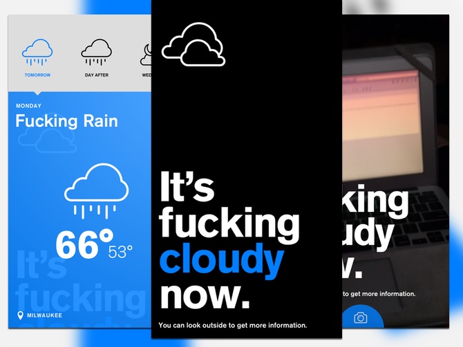
Authentic Weather has a simple premise: to tell you the fucking weather. If the novelty of a weather report that drops the F-bomb doesn’t interest you, you likely aren’t going to enjoy this app.
The app’s simple interface consists of three panes. The far left pane let’s you change the units between Celsius and Fahrenheit. The center pane is the app’s default view, and shows the current conditions. You can tap and hold your finger for a second to get the current temperature, which appears as an overlay. If you’d rather view the forecast, you can pull down and get the next three days’ conditions and temperatures. If you swipe to the left, you’ll get the right pane, which lets you take a picture and share it on Facebook or Twitter.
There is no shortage of iOS weather apps, and while Authentic Weather breaks the mold with some crass language, it offers little else. The sharing features are interesting, but only if you want the world’s most boring social media feed.
I’m still a big proponent of Dark Sky, as it breaks down conditions over the next few hours. Authentic Weather is only really useful at providing current conditions and what to expect over the next few days. When you live in the sort of climate where the day can start out like Seattle and turns to Miami by mid-Afternoon, you need to know a little more detail.
What’s Good: Funny concept. Good layout.
What Sucks: Lacks a lot of details.
Buy it?: If you don’t really worry about detail and are looking for a laugh when you check the weather, give Authentic Weather a go. Grab it for 99 cents in the App Store.
Amazon Prime Music – iOS (Universal), Mac

As much as I want to tell you how crappy the Amazon Prime Music service is, I don’t want to underestimate Amazon’s development team. I could wave off their offering today, only to watch it coalesce into a proper streaming service over the next few months.
Right now, however, the service seems to be piecemeal. Some artists have missing albums, while others only have a few tracks on offer. To access the service, you need to use one of the existing Amazon Music apps on OS X or iOS. The service’s signature offering seems to be its custom playlists. They seem to have cribbed these from Beats, with titles like “The 50 Most Epic Classic Rocks Songs.”
Prime Music is obviously no Spotify, but it’s likely going to chug along until Amazon can leverage its competitive advantages to get a better catalog. Amazon did it with Prime Video, and there isn’t any reason to think that they won’t do it again with Prime Music. Unless you’re already a Prime Subscriber, you aren’t going to want to go out of your way to use Prime Music. Prime Subscribers who don’t currently have a streaming preference may find something passable here. I wouldn’t count Amazon out, but for now their offering gets a ‘meh.’
What’s Good: Built into your existing apps and Prime subscription.
What Sucks: Spotty catalog.
Buy it? Prime Subscribers still looking for streaming provider should check out Prime Music. The Amazon Music Apps are free on the App Store and Amazon’s site.
Marco Polo – iPhone

We have seen quite the leap in the design and capabilities of mobile apps since the launch of the App Store. iOS is by far the most conservative of the mobile OSes, and an app like Marco Polo shows why that conservatism can limit apps with novel ideas.
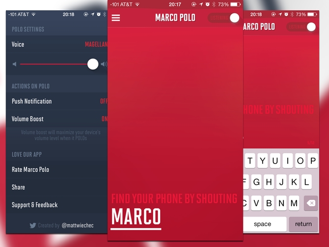
Marco Polo is a clever app that helps you track down your misplaced iPhone: It uses the system microphone to listen for someone saying “Marco,” and then the phone will yell back “Polo.” It’s a neat idea, as long as you don’t have any kind of Bluetooth headset or speaker connected.
But then it runs into iOS’s limitations. Marco Polo uses microphone access meant for recording audio, rather than passive listening, which means that you’ll need to manually kill Marco Polo before you plug in any headphones or listening to audio or it will be muted. This also means that in addition to remembering where you left your phone, you’ll need to remember to open this app before you set your phone down.
There’s also a bit of a tradeoff in the battery usage: My iPhone quickly burned through my battery every time I used the app. But limitations aside, the idea behind the Marco Polo is genius.
What’s Good: An excellent idea…
What Sucks: …that is hamstrung by missing APIs and battery issues.
Buy it? If you’re super forgetful about where you put your phone, and don’t use a lot of audio or headsets, check out Marco Polo. Get it for 99 cents on the App Store.
Unread for iPad – iPad

The RSS reader app Unread made quite the splash when it landed on the iPhone. We reviewed it back in February: It gained some polish on its way to the iPad, and its developers fixed some of the biggest gripes I had when I last looked at it.
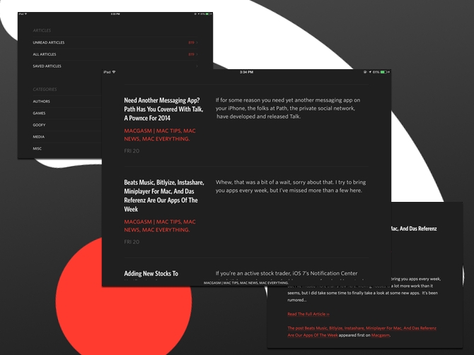
Unread works with RSS services like Feedly, Feed Wrangler, NewsBlur, Feed Bin, and Fever. Every one of the big RSS clients has an angle, and Unread‘s is its design. The app fully embraces the iOS 7 language—you get a minimal, well-done interface with nice typography. There are a few different themes available that change the text and background color. The big guns of sharing are all included—you can share articles via Twitter, Facebook, Instapaper, Pocket, Pinboard, and other social media services.
The sharing feature isn’t perfect—Pinboard doesn’t let you add your own tags, for example. Evernote support would a welcome addition as well. Emailing articles works, but for some reason, Unread doesn’t parse GIFs correctly. The doesn’t sync with Feedly as frequently as I’d like, so sometimes you will find that articles you’ve read still show as unread if you go and pick up on another device.
These same issues are present in the iPhone app, so if you’re happily using it there you can start using this app immediately on your iPad. If you’re a fan of Mr. Reader or a more power-user-oriented RSS reader, though, you may want to take pause until the sharing functions get worked out.
What’s Good: Well designed interface. Multiple themes to better suit your reading preferences.
What Sucks: Sharing has some quirks.
Buy it? Fans of the iPhone app should grab Unread for the iPad. It’s $4.99 on the App Store.


