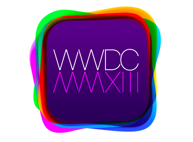
Apple isn’t known for giving hints on future product releases, although they tend to do so when sending out invitations to WWDC as well as some of their other press events. In previous years these hints have been pretty easy to spot, though this year it hasn’t been so easy. Weeks after invites were sent out, entrepreneur Joshua Merrill thinks he may have scouted it out.
Merrill thinks that the many stacked tiles on the invite are the preloaded apps that come with iOS. For instance, the green tile is for Messages, the purple is for the iTunes Music Store, etc. Judging from the image, the tiles seem a bit redesigned to look flatter with brighter, more pastel colors. The invite also features a thin and clean font.
If this prediction is indeed true, it would match up with what 9To5Mac reported today. According to the report, iOS 7 should bring a flatter design with more black and white coloring scattered about the operating system. As far as the icons go, the publication said that iOS 7 icons “lose shine, shadows and gloss, the buttons are still round and just as tappable.” Only time will tell.


