Keeping a journal was hard. Now it’s easy.
Everyone wants to keep a diary. Okay, a journal for you masculine men out there. However, not many can keep up with the tedious process of sitting down daily to recollect all the events of the day and jotting them down in a tiny notebook. Besides, the ink smears, pages crinkle, and… and… – you get the point. Now for some, things would have ended there. However, a few enthusiastic customers waited for change, waited for someone to solve the age old digital-journal conundrum. Some programmers decided to take up the challenge by relocating the notebook to something that doesn’t annoy the majority. Their efforts, on the whole, often missed the market entirely. A whole myriad of journaling apps hit the market, but users weren’t content with the results.
One user in particular decided to do something about it.
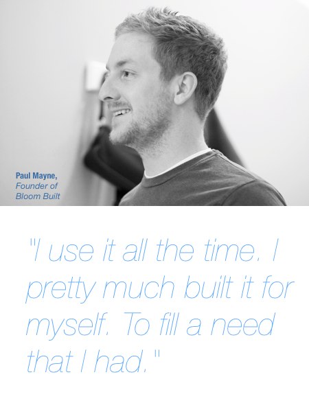
Users complained of apps not backing up, apps crashing, apps this and that. Once again, a lot of developers called it quits, moved on, but there was one developer who remained. There was one who followed the saying, “if you want something done right, you’ve got to do it yourself.” That person is none other than Paul Mayne, and his product? The often celebrated Day One.
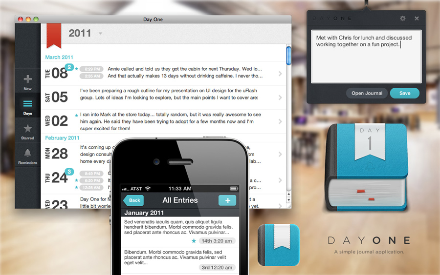
Day One is by far the best journal app on both App Stores (iTunes and Mac App Store). Its interface is beautiful and it’s obvious that the creator has a thing for design. Not only is the app on the iPhone, iPad, and the Mac, but they all integrate seamlessly. “Day One is designed and focused to encourage you to write more,” says Mayne. “Using the Menu Bar quick entry, Reminder system, Calendar view and inspirational messages, your memories and thoughts will be preserved. Dropbox sync allows easy backup and syncing with the both Day One iPhone and iPad applications.”
How was it built?
Mayne was just like any of us. He searched through the App Store every now and then, looking for the perfect journaling app. But, nothing really suited the need that he had. “They were all so cumbersome when I just wanted simple,” he said. Eventually he regressed to journaling his day in TextEdit. “Hey, at least it was simple… and it worked.” However, during this time an idea began to develop in his mind. Mayne wanted to create a simple app that would solve his problem. When Apple announced the Mac App Store, Mayne knew the moment was right.
Like a lot of entrepreneurs before him, he had an idea, but didn’t know where to start. Mayne had been a UI designer for several years and did Flash development, but it was mostly visual, front end stuff. Two years ago, he decided to go full-freelance and focus on iOS design projects; however, programming wasn’t exactly his — you know — forte. While he did help out with the popular I.TV app and a few other clients, they only whet his appetite for iOS. By being in constant contact with the developers, he began to visualize the possibilites that this promising platform had in store for him. It was time. He was ready to tackle his own project.
I’m a big believer in this. If you are a designer and you don’t program anything, you still need to understand the technology behind it. If you don’t know it, or you only know a little, knowing what the possibilities are and what the limits are will make you more efficient. You’ll make better products.
Although he was armed with enthusiasm and some skills, Mayne was faced with some challenges. “On the Mac, I didn’t realize how difficult it was to do custom UI stuff,” he said. “Coming from the web design field where you can customize anything, I was surprised that there wasn’t a lot of custom UI elements in Mac apps.” That’s when Mayne realized that he’d have to bring someone else on board. “I found a guy that was really good and ambitious. He was willing to take my stuff and program it as I envisioned it.”
While the app is already a success, Mayne is just getting started:
There’s still a ton more that I want to add to it, but people accepted that. I think it was a good project that can be launched and upgraded in phases and still be useful. As long as there’s the syncing and the text entry, naturally.
What can we take away from the Day One origin story?
We often sit around and wait for something to be done for us. In the case of apps, we notice a problem that needs to be addressed. However, we assume that with time someone will eventually build it for us. Why can’t we be that someone? Why can’t we set out to build it ourselves? That’s exactly what Mayne did. He’s a successful example of just how far the can-do attitude can carry someone. Yes, he had a design background, but when he entered the iOS and OS X field, he was as new to it as anyone else. But, instead of remaining stationary, Paul sought out help and persevered to the end.
From start to finish, Day One took about five months to develop, which also happened to be two months longer than Maybe originally planned. However, his app, Day One, has already been featured in the New and Noteworthy section of the App Store. Day One has already hit the number one spot twice, and reached the top 10 list for paid apps on the Mac App Store. Heck, it still remains in the top 20-30 paid apps on the Mac App Store. The iOS app has had similar success.
With all this said, and after having a great dialog with Mayne, my advice to you today is this: It’s clear that the app platform is a great place to show your creativity. Have a solution to a problem? Get out there and build it. However, don’t expect everything to go according to plan. “Originally I had planned on doing the iOS app first,” Mayne said, “but by chance, they ended up being ready around the same time and launched at the exact same time, which turned out to be a better solution.”


