As popular as its standard mobile app may be, not everything Facebook has put out there has been particularly successful—or especially unique (Poke, I’m looking in your general direction). Facebook’s latest freebie, controversially named Paper, resembles existing reading apps like Flipboard and Pulse, but with your Facebook newsfeed baked in. Here’s what you can expect from it, based on my initial impressions.
The first thing you’ll notice about Paper [iTunes link] is just how polished it is. When you open Paper for the first time, you’ll be greeted with a short promotional video followed by a walkthrough of the app, complete with a voiceover. Photos cross-fade from one to the other. When you flick down to reveal the app’s settings, your Facebook cover photo appears blurred in the background. Articles you tap to read “fold” open and closed, sort of like a folded newspaper. The whole thing feels right at home on iOS 7.

If you are already logged in to Facebook through the standard Facebook app, you shouldn’t have to sign in to your account again through paper—a time-saver, though not necessarily the most secure approach to things. Paper does just about everything that the standard Facebook app does, though some sections, such as pages you manage or groups you belong to, are tucked out of the way.
App navigation relies mostly on gestures. There are only a few buttons, and the buttons that do exist are mostly for things like Facebook notifications, Chat, comments, likes, and such. The app shows you how to use the gestures as you go along; they may take a little getting used to, but once you get the feel for how Paper works, the gestures make sense and feel rather natural.
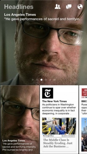
Paper’s first section is for your Facebook newsfeed. The top half cycles through images and links that your Facebook friends have posted; the bottom half shows other items in your newsfeed, as represented by a scrollable row virtual cards. Swipe up on a card to get a closer look, or swipe left or right to see other cards.

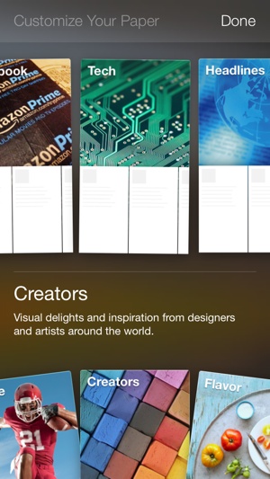
Swipe the top image to get beyond the first section, though, and Paper morphs into a newsreader of sorts. In fact, if you’ve ever used an app like Flipboard, you’ll feel right at home with Facebook Paper. These sections use the same split-pane-and-cards layout as the Facebook Newsfeed section, and when you fold out an article, you’ll be taken to that article on that publication’s mobile site.
As far as I can tell, you can’t edit which publications appear in which sections, so you’re basically stuck with whatever Facebook thinks you should read. Also, there’s no way to create a custom section where you get to pick and choose what you’d like to see.
Naming issue aside, Facebook Paper is a sleek, smooth, attractive app, and it’s worth a download if you’re a Facebook user. That said, I would love to see a little more flexibility in the app, and I can’t help but wonder if Facebook has bigger plans for it. Only time will tell, I guess.


